
3D Regression Heat Maps: Bridging the Gap Between Big Data and Epidemiological Insight
3D Regression Heat Map Analysis of Population Study Data
The paper introduces the 3D Regression Heat Map, a visual analytics approach for exploring epidemiological population studies. It combines exhaustive regression modeling (linear and logistic) with a novel 3D visual encoding to identify disease risk factors across hundreds of heterogeneous features.
TL;DR
Epidemiologists often drown in thousands of features—from lifestyle habits to MRI data. This paper presents a 3D Regression Heat Map that automates the calculation of thousands of regression models and visualizes their quality-of-fit (, AIC) in a 3D prism. It allows researchers to spot "hotspots" of correlation instantly, turning months of manual hypothesis testing into minutes of interactive exploration.
The Problem: The "Hypothesis Trap" in Epidemiology
Standard epidemiology follows a strict pipeline: observe, hypothesize, then test. While rigorous, this approach is slow and suffers from selection bias. If a researcher doesn't suspect a link between, say, kidney health and breast density, they might never run the regression for it.
Existing visual tools like Scatter Plot Matrices (SPLOMs) fall apart when you have 200+ features (the "curse of dimensionality"). We need a way to look at the entire model landscape at once without losing the statistical familiarity of regression analysis.
Methodology: Engineering the "Model Space"
The core innovation is shifting from visualizing raw data points to visualizing model quality metrics.
1. The Dynamic Formula
The authors use a syntax familiar to R users: Target ~ X + Y + Z. By using dynamic variables, the system iterates through every possible feature combination. For 100 features, this could mean millions of models—a computational nightmare.
2. Smart Pruning (Analyze First)
To solve the complexity, the system uses Correlation-based Feature Selection (CFS). It identifies a subset of features (usually 10-30) that have the highest explanatory power for the target, discarding redundant features (like "Height" vs "BMI" if they carry the same information).
3. The 3D Prism Encoding
Instead of a flat 2D correlation matrix, the 3D Prism maps:
- X and Y Axes: Independent features.
- Z Axis: The target feature (disease or condition).
- Color/Opacity: The or AIC value (saturated/opaque = strong relationship).
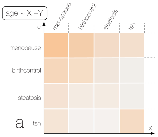 Figure 1: Transition from a 2D slice (looking at one disease) to a 3D overview (all features vs. all targets).
Experimental Results: Real-World Discoveries
The authors tested their tool on two major datasets:
Case 1: Hepatic Steatosis (Fatty Liver)
The system correctly identified somatometric features (weight, waist circumference) as primary drivers. Interestingly, it highlighted Interleukin-6 (IL-6) as a significant correlate (R² of 0.8), mirroring recent findings in liver cancer research that might have been overlooked in a standard survey.
Case 2: Breast Density & Cancer Risk
A radiologist using the tool confirmed established links (age, body fat) but discovered an outlier: a strong correlation between kidney disorders and breast parenchyma tissue. While the sample size was small (8 cases), it provides a concrete, data-driven lead for a targeted clinical study.
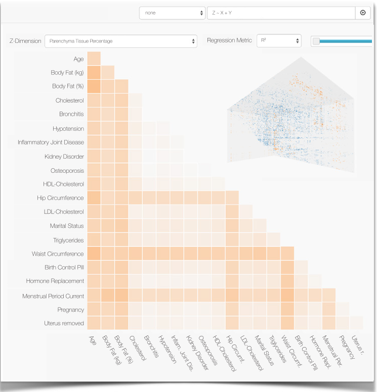 Figure 2: The 3D Prism highlighting hotspots in the Hepatic Steatosis analysis (left) and Breast Density analysis (right).
Critical Insight: Transparency Over Black-Boxes
The most profound takeaway is the reaction of the clinical experts. They preferred this "Interactive Visual Analysis" over automated black-box machine learning (like Decision Trees). Why?
- Confidence: Seeing a "hotspot" yourself is more convincing than a computer saying "Feature X is important."
- Context: Experts can instantly recognize "nuisance correlations" (e.g., body size correlating with spine shape) and filter them out.
- Iteration: The ability to adjust formulas on the fly allows the "human-in-the-loop" to steer the statistical engine.
Conclusion
The 3D Regression Heat Map represents a significant shift in medical informatics. By abstracting thousands of regressions into a single, navigable 3D volume, it allows epidemiologists to remain "scientists" (interpreting nature) rather than "gardeners" (tending to spreadsheets).
Future Work: The authors plan to extend this to time-dependent data, allowing researchers to visualize how disease risk factors evolve over a person's lifespan or across study waves.