
C4PS: Turning Privacy Settings into a Visual Traffic Light System
C4PS - Helping Facebookers Manage Their Privacy Settings
C4PS (Colors for Privacy Settings) is a novel interface framework designed to improve privacy management in Online Social Networks (OSNs) like Facebook. Using a traffic-light color-coding system and one-click configuration, it significantly outperforms native interfaces in usability and accuracy.
TL;DR
Despite growing privacy concerns, most users find Facebook’s privacy settings a "confusing mess." The C4PS (Colors for Privacy Settings) project reclaims control by replacing complex menus with a simple, color-coded overlay. By using a traffic-light metaphor, it reduces clicks by 3x and boosts configuration accuracy by nearly 25%.
The "Invisible Over-sharing" Crisis
We live in an era where "sharing" is the default. OSN providers often benefit from open settings, leading to UI designs that hide privacy controls in deep sub-menus. The authors point out a critical irony: users care about privacy (awareness is high), but they are incapable of managing it (competence is low) because the interfaces are fundamentally hostile to human psychology.
Methodology: The Psychology of Color
The core "Insight" of C4PS is the Mental Model Shift. Instead of asking a user to read "Visible to friends of friends," C4PS uses the universal language of symbols:
- 🔴 Red: Strictly private (visible to nobody).
- 🔵 Blue: Custom/Selective access (the "nuanced" middle ground).
- 🟡 Yellow: Friends only.
- 🟢 Green: Public/Everyone.
Architecture of the Interface
The authors followed four pillars: Little Effort (P1), Common Practices (P2), Direct Success Control (P3), and Easy Applicability (P4).
 Figure 1: The C4PS interface allows one-click modification with instant color-coded feedback.
Instead of navigating to a separate "Privacy Settings" page, C4PS overlays these controls directly on the profile. If you want your birthday to be private, you click the Red button next to it. The cell turns red instantly, providing "Direct Success Control."
Experimental Results: A Brutal Comparison
The authors conducted a lab study comparing the native Facebook interface with their C4PS mockup. The results were stark:
- The SOTA Gap: Facebook’s native UI received a 35 on the SUS (System Usability Scale)—a score considered "unacceptable." C4PS scored 82.6, placing it in the "Excellent" category.
- Success of "Experts": Interestingly, even "Facebook Experts" (people using the site daily) only had a 73% success rate on the original site. With C4PS, that number climbed to 94%.
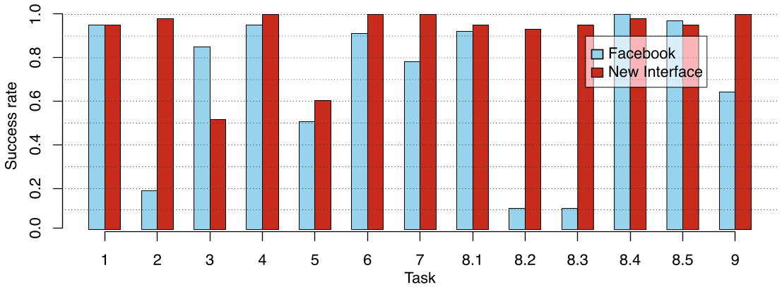 Figure 2: Success rates across various tasks (Task 1-9). C4PS consistently outperforms the native Facebook UI.
The data suggests that the "Hometown" setting (Task 2) was the most difficult in the original UI (17.5% success) because it was hidden in a "Connecting on Facebook" sub-menu. C4PS solved this by bringing all attributes onto a single, unified editing plane.
Critical Insights & Takeaways
The brilliance of C4PS lies in its lack of novelty. By using traffic lights—a concept we learn as children—it bypasses the need for a manual.
Limitations
- Color Blindness: While blue was added for custom settings, the heavy reliance on red/green could pose accessibility issues (though the paper mentions using tooltips as a fallback).
- Dynamic UI: Facebook's "Timeline" update happened during the study, showing how fragile third-party privacy tools can be when the platform's DOM structure changes constantly.
Future Outlook
The authors released a Firefox plugin to implement this on the then-new "Timeline" view. In today's context, C4PS serves as a precursor to the "Privacy Dashboards" we now see in modern OS designs. It teaches us that the best way to protect user data isn't to add more features, but to visualize current states more clearly.