
Multi-Layered Social Visualization: Beyond Simple Nodes and Links
Design and implementation of the contents visualization system for social networks
This paper presents a multi-dimensional Social Network Visualization System that maps relationships between users, communities, and digital contents. By integrating these three elements into a layered graph architecture, the system achieves intuitive monitoring of social interactions and content sharing patterns within the SMCS framework.
TL;DR
Existing social graphs often feel like a "hairball" of connections that lack context. Researchers at ETRI and Kyungpook National University have developed a new visualization system that adds two critical dimensions—Communities and Contents—to the traditional user graph. By using a layered architecture and specialized centrality algorithms, they’ve turned abstract social data into an intuitive, 3D-navigable map.
The Motivation: Why Your Current Social Graph is Broken
Most Social Network Services (SNS) treat relationships as simple A-to-B connections. However, in the real world, we connect through things: a shared camera club, a specific news article, or a professional project.
The authors argue that the missing link in social visualization is the "Community" context. Without visualizing the group and the specific content being shared, a social graph is just a skeleton without muscle. Their goal was to create a system where the distance between nodes actually represents the "social gravity" of shared interests.
Methodology: The Three-Layer Architecture
The system breaks down a social network into three distinct but interconnected layers:
- Contents Layer: Digital media created by users (documents, photos, experiences).
- User Layer: The individuals interacting within the network.
- Community Layer: The topical or locational groups that house users and their content.
The Math of Social Gravity
To determine where every node goes and how big it should be, the system calculates two primary metrics:
- Degree Score: The sum of a user's relations and their shared contents. This determines the radius of the user's influence.
- Betweenness Score: A measure of a community's importance, calculated by the number of joined users plus the total contents shared within it.
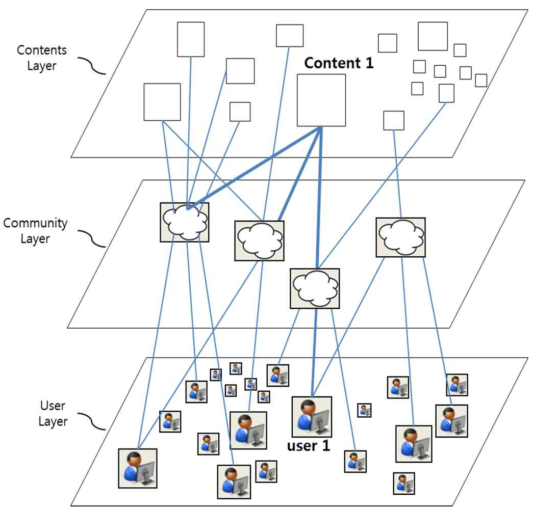 Figure 1: The conceptual model showing the interplay between Content, User, and Community layers.
The Closeness Manager
One of the most innovative features is the Closeness Manager. If a user belongs to multiple communities (e.g., a school group and a photography club), the system doesn't just put them in the middle of nowhere. It calculates a position that minimizes the sum of distances to all associated communities, effectively "pulling" the user toward their most active social spheres.
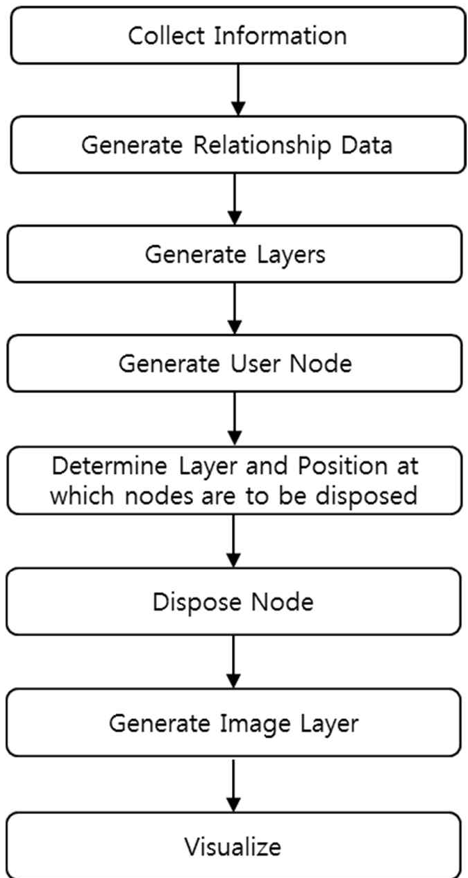 Figure 4: Spatial optimization for a user node connected to multiple community clusters.
Experiments & Results
The system was integrated into the Social Media for Cool Space (SMCS) framework. The implementation shows that when a user searches for a keyword, the system doesn't just provide a list of posts. Instead, it generates a graph where nodes are sized by their centrality and tiered by their layer.
The visual result is a clustered map where "busy" communities are large and central, and the users most responsible for content creation are naturally highlighted. This provides "Search Intuition"—the ability to see the source and the social context of a piece of information at a single glance.
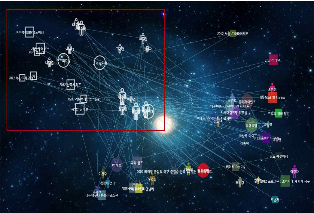 Figure 6: A snapshot of the implemented engine displaying real-time user-community-content associations.
Critical Analysis & Conclusion
Takeaway
This work moves social network analysis from Topology (who knows whom) to Ecology (how do users, groups, and data coexist). By weighting nodes using both social connections and content volume, it provides a much more accurate representation of digital influence.
Limitations
While the system is excellent for medium-scale communities, the paper does not extensively discuss "Visual Clutter" management for massive networks (millions of nodes). The 3D layering is helpful, but performance at scale remains an open question for future research.
Future Outlook
This methodology has significant potential for Recommendation Engines. Imagine a search engine that doesn't just give you a link, but shows you the specific community of experts from which that link originated. That is the future of "Intuitive Search" promised by this system.