
Beyond the Desktop: Why Culture Dictates How We "See" Metaphorical Icons
Cross-Cultural Understanding of the Dual Structure of Metaphorical Icons: An Explorative Study with French and Turkish Users on an E-Learning Site
This paper investigates the cross-cultural understanding of metaphorical icons in Graphical User Interfaces (GUIs), specifically focusing on the dual structure of image and label. Through an empirical study on the French e-learning platform ACOLAD with French and Turkish users, the authors analyze how cultural background influences the interpretation of spatial metaphors.
TL;DR
In the digital world, a "campus" is not just a collection of links—it's a mental model. This study reveals that for e-learning platforms, the effectiveness of a metaphor (like a "Foyer" or "Office") depends heavily on a user's real-world cultural habits. While French students intuitively understood architectural icons of their universities, Turkish students experienced "metaphorical inconsistencies" because their physical campus experiences didn't match the software's visual logic.
Background Positioning
In the landscape of Human-Computer Interaction (HCI), this work serves as a critical bridge between Cognitive Psychology (Dual Coding Theory) and Intercultural Communication. It moves beyond the "what" of icon design to the "why" of cultural perception, positioning itself as a foundational study for localized UX design.
The "Dual Structure" Problem
Authors Kerem Rızvanoğlu and Özgürol Öztürk argue that a metaphorical icon is never just a picture. It is a dual-coded entity consisting of an image and a label.
- The Image taps into our physical experience (what an office looks like).
- The Label taps into our linguistic upbringing (what the word "Bureau" implies).
The core problem? If your cultural "source domain" (real life) doesn't match the "target domain" (the interface), the metaphor breaks, leading to frustration or rejection.
Methodology: Deconstructing the Virtual Campus
The study focused on ACOLAD, a French e-learning site using a "Campus" metaphor. The researchers split the icons into their graphical and textual components to see which caused the most confusion for 68 Turkish and French students.
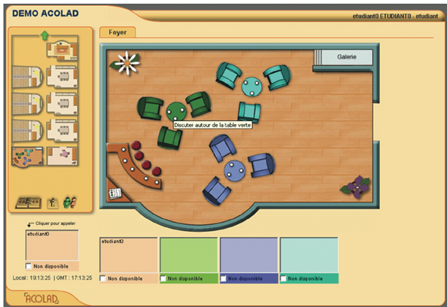 Figure 1: The spatial navigation bar of ACOLAD, using architectural floor plans as icons.
Key Insights: Affinity vs. Contrast
The study utilizes a fascinating theoretical framework: the Recursive Refinement Process. For a metaphor to work, there must be a balance between:
- Affinity: Elements that match the user's experience.
- Contrast: Elements that signal this is a digital tool, not the real thing.
1. The French Experience: Conceptual Baggage
Surprisingly, being too familiar with a metaphor can be a problem. French users had such high affinity with the "Foyer" (student lounge) metaphor that they expected the system to allow them to "eat, drink coffee, or smoke." This is called Conceptual Baggage—the metaphor led them to believe the product could do things it physically couldn't.
2. The Turkish Experience: Metaphorical Inconsistency
Turkish students struggled with the "Foyer" and "Groupes" icons. In Turkish universities, social spaces function differently than in French ones. When they saw the label "Discussion," it felt formal and individualistic (Collectivist vs. Individualist culture), whereas they expected "Chat" or "Canteen" for a social space.
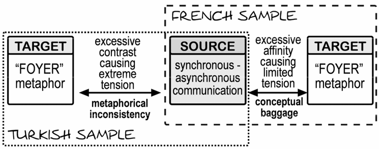 Figure 2: The tension between the source function (e-learning communication) and the target metaphor (Foyer).
Critical Analysis & Conclusion
This paper highlights a vital lesson for global product design: Localization is not just translation.
- The Power of Text: For non-native speakers (Turkish group), when the label was unclear, they lost confidence in the icon entirely. Text acts as a "validator" for the image.
- The "Optimal Tension": Designers must avoid metaphors that are so literal they invite "baggage," but familiar enough to avoid "inconsistency."
Takeaway for Designers
When designing global interfaces, don't just ask "What does this icon represent?" Ask "What does this icon remind a user of in their physical daily life?" If the answer varies by country, your metaphor is a liability, not an asset.
Limitations
The study is qualitative and based on a specific student demographic (21-24 years old). Future research needs to explore if these cultural gaps diminish with "Digital Natives" who are more accustomed to globalized UI patterns than physical architectural metaphors.
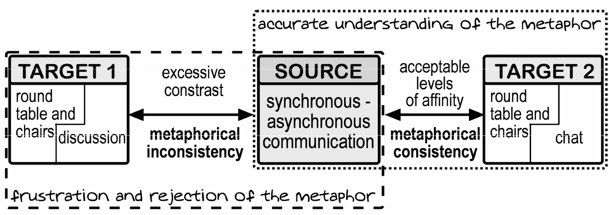 Figure 3: Suggested interaction between Image and Label to achieve cultural consistency.