
Algorithmic Curation: Rethinking HCI History Through the Lens of Abstract Art
Disseminating Scientific Development Through Artistic Practice: The HCI History Poster
The paper presents an algorithmic approach to generating artistic visualizations of scientific history, specifically creating the "HCI History Poster." By parsing the CHI conference corpus (1981–2016) and using citation metrics alongside grammatical modifiers of "interaction," the authors map the field's evolution following the aesthetic logic of Alfred Barr’s 1936 "Cubism and Abstract Art" chart.
TL;DR
Can we view the history of Human-Computer Interaction (HCI) as a series of "artistic movements"? This paper introduces an algorithm that transforms 35 years of CHI conference data into a machine-generated poster inspired by 1930s avant-garde art charts. It bridges the gap between Scientometrics and Fine Arts, turning data points into a didactic historical survey.
Backtrack: The Motivation
In 1936, Alfred Barr Jr. created a now-legendary diagram for MoMA's "Cubism and Abstract Art" exhibition. It wasn't just a list; it was a map of influence, showing how movements like Futurism and Dadaism collided to create new forms.
The authors of this paper noticed that while we have tools like Streamgraphs or Force-directed graphs, they are often "too clinical." They lack the narrative weight and aesthetic "interpretation" that a curated history provides. The goal here was to see if an algorithm could act as a curator, identifying "Notable Topics" (the "isms" of HCI) and "Prominent Authors" (our "artists").
Methodology: Coding the Curator
The researchers didn't just plot dots on a timeline. They used a sophisticated dataset of "interaction modifiers"—words that describe how we interact (e.g., "Social," "Tangible," "Seamless").
1. The Data Source
The algorithm draws from two primary sets:
- The CHI Corpus (1981–2016): Analyzing modifiers of the word "interaction."
- Google Scholar Citation Data: Identifying the "influencers" (most cited authors).
2. The Artistic Mapping
To replicate the Barr aesthetic, the algorithm followed four distinct mapping rules:
- Notable Topics (The Isms): Interaction quality modifiers (Black, Uppercase).
- Prominent Authors (The Artists): Most cited first authors of the era (Capitalized).
- Applied Research (The Work): Interaction styles often found in applied papers (Red, Outlined).
- Relations: Lines connecting authors and modifiers based on publication history.
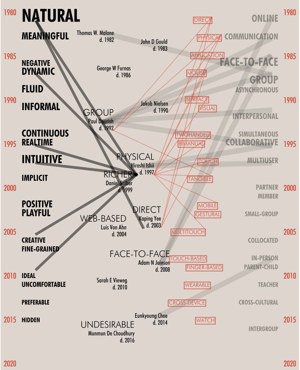 Figure: The machine-generated HCI History Poster, organizing decades of research into a visual narrative.
Why It Matters: Art as Research Dissemination
The paper leans heavily on the philosophy of Bruno Latour, suggesting that art has the power to "explicate" or make visible connections that science alone might miss.
- Breaking Silos: By visualizing links between "Social Interaction" and specific authors across decades, the poster reveals the evolution of thought rather than just a list of citations.
- The Spectator as Co-Producer: Unlike a standard bar chart, this poster invites the viewer to interpret the connections. It treats the "spectator" as an active participant in understanding the history of the field.
Results and Limitations
The resulting poster (accessible via the authors' GitHub) provides a unique vertical timeline of the CHI conference.
Key Findings from the Poster:
- The shift from technical hardware-centric modifiers in the 80s to "Social" and "Qualitative" modifiers in the 2010s is clearly visible.
- The most influential authors are positioned not just by citation count, but by their connection to specific "movements" in interaction style.
The Catch: The authors admit that NLP has its limits. High-frequency words like "novel" or "computer" are often noise. They had to implement a "stop-word" list to prevent the poster from being dominated by generic academic jargon. Furthermore, a simple line "connection" doesn't strictly prove causality—it only shows a shared conceptual space.
Critical Insight: The "Idiot" at the Exhibit
The paper concludes with a fascinating look at the "Idiot" (a philosophical term for the uninterested or unexpected audience). By turning scientific history into an artistic poster, we can engage people who would never read a 35-year meta-analysis paper. This is the future of Science Communication: turning data into an "event" that creates new identities and relations.
Summary Takeaway
This work isn't just about a poster; it's a manifesto for Cross-Disciplinary transgressions. It proves that the history of technology is as much an "artistic development" as it is a scientific one. For future researchers, this opens the door to using generative AI not just to summarize text, but to "curate" the soul of a discipline.