
Twitter as a Human Sensor: Revolutionizing Mobile Traffic Demand Forecasting
Estimating Mobile Traffic Demand Using Twitter
This paper proposes using geo-tagged Twitter activity as a high-resolution predictor for spatial-temporal mobile data demand. By analyzing 0.6 million tweets and 1.2 million cellular records in London, the authors demonstrate that social media intensity follows a power-law relationship with actual 3G traffic, significantly outperforming traditional census-based models.
TL;DR
Researchers have successfully used geo-tagged Twitter data to predict mobile network traffic demand with unprecedented accuracy. By modeling the relationship between "tweets per second" and "kilobits per second," the study achieves a 71-79% variance explanation, far surpassing traditional census-based methods. This approach allows operators to predict demand 2 hours in advance and better plan the deployment of small-cell base stations.
Background: The Microscopic Turn in Cellular Planning
As we move toward 5G and 6G, the industry is shifting from massive macro-cells to "small-cells"—tiny base stations with a coverage radius of just 10-25 meters. However, deploying these is an economic gamble. If you place a small-cell where people aren't actually using data, you waste capital; if you miss a hotspot, the network chokes.
The current standard—using census data or operator-specific logs—is failing. Census data tells you where people live, not where they consume data (as seen in tourist hotspots like Marylebone High Street). Mobile logs are often siloed within a single operator, missing the "big picture" of the total market. This paper asks: Can we use the public signal of social media to solve this?
The Core Insight: The Power-Law of Social Content
The authors hypothesized that while a tweet is a tiny burst of uplink data, it serves as a proxy for broader human behavior. If people are tweeting, they are also likely streaming, browsing, and messaging.
1. Spatial Correlation
The researchers mapped Greater London, correlating tweet density with 3G traffic records. They discovered that the relationship obeys a Power Law: Where is the predicted traffic and is the tweet frequency.
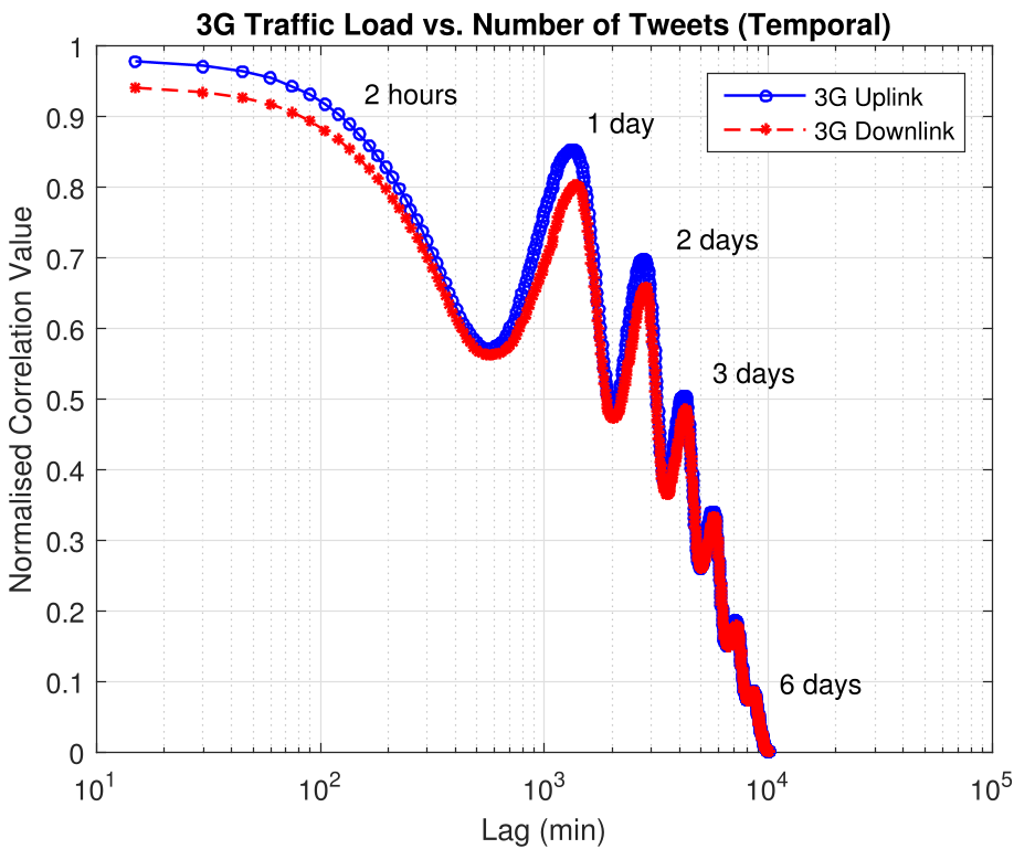 Fig 1: Spatial Correlation of average 3G Traffic Load vs. Number of Tweets. Note the strong log-linear alignment.
Methodology: From Long-Term Density to Short-Term Peaks
Beyond just knowing where to put a base station, operators need to know when the traffic will hit.
- Short-Term Forecasting: Using cross-correlation, the study found that current Twitter activity can predict traffic demand for the next 120 minutes with over 90% accuracy.
- Peak Demand Prediction: By analyzing the variance () and mean () of tweet activity, they developed a model to predict "bursty" peak demand, which is critical for avoiding service outages.
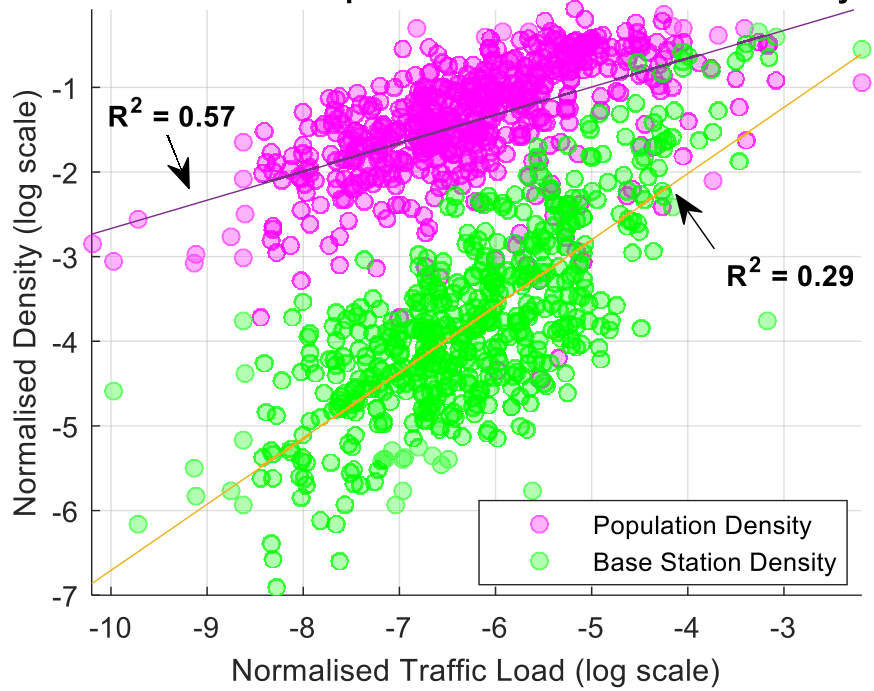 Fig 2: Comparison of Population vs. Traffic Demand. The model identifies outliers like Marylebone High Street where traditional census data fails.
Why This Matters: Operator and RAT Neutrality
The most profound impact of this research is "Neutrality."
- Operator Neutral: Unlike CDR data (which only sees Vodafone or O2 customers), Twitter data sees everyone.
- Technology (RAT) Neutral: It reflects demand across 3G, 4G, 5G, and Wi-Fi simultaneously.
This allows for "Self-Organizing Network" (SON) operations where a network can preemptively offload traffic to small-cells based on a spike in social media activity before the bottleneck even occurs.
Critical Analysis & Conclusion
While the results are impressive ( up to 0.79), there is a significant "Dark Data" problem: only about 1% of tweets are geo-tagged. The model relies on this 1% being a representative sample of the 100%. Furthermore, as social media habits shift from text-based Twitter to video-heavy platforms like TikTok, the coefficients of the power law ( and ) will likely need continuous recalibration.
Takeaway: This work proves that digital footprints are no longer just for marketing; they are critical infrastructure sensors that can optimize the physical architecture of our wireless world.
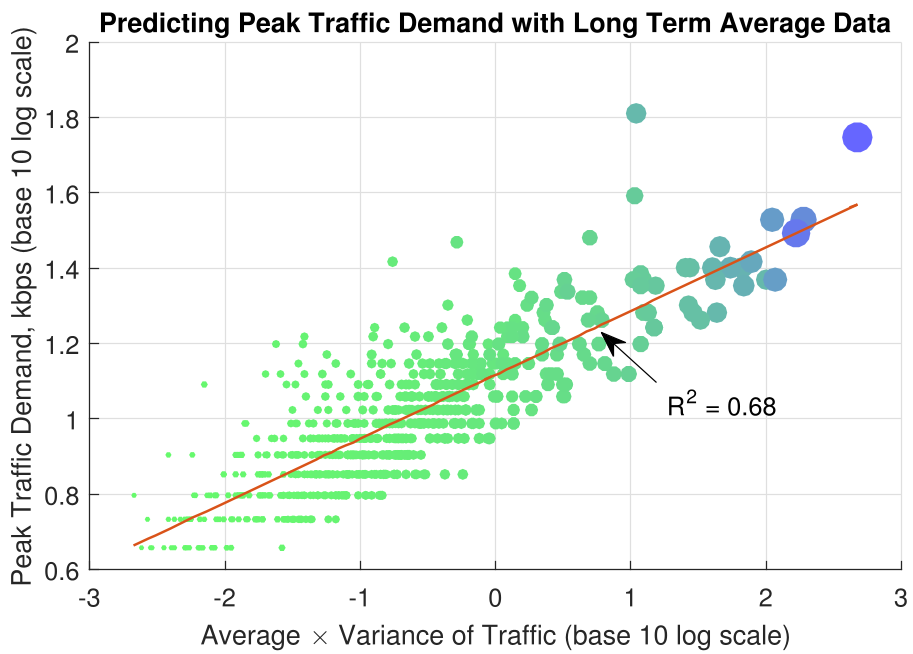 Fig 3: Time-lagged correlation showing the 2-hour and 24-hour predictive window.