
Beyond Efficiency: Why We Love Facebook Despite Its "Bad" Design
Exploring the facebook experience: a new approach to usability
This paper explores the paradox of Facebook's immense popularity despite its failure to meet traditional usability standards. By combining Heuristic Evaluation and qualitative user studies, the authors identify that positive "User Experience" (UX) elements like curiosity and social pleasure effectively override functional usability flaws.
TL;DR
At the height of its growth in 2008, Facebook technically "failed" almost every standard usability test. This seminal paper from Lancaster University argues that Facebook’s success wasn't due to efficient design, but rather a powerful User Experience (UX) that prioritized social pleasure and curiosity over traditional task completion. In short: we don't mind a cluttered interface if it helps us "stalk" our friends effectively.
Background: The Usability Paradox
In the early days of HCI (Human-Computer Interaction), "good design" meant a user could get in, find what they needed, and leave as fast as possible. Then came Facebook. It was cluttered, inconsistent, and often confusing—yet users were spending hours "hanging around." The authors set out to find why people loved a product that, according to the rules of science, was poorly built.
The "Failure" of Traditional Heuristics
The researchers first applied Nielsen’s 10 Usability Heuristics—the gold standard for interface design. The results were disastrous for Facebook:
- Consistency & Standards: Failed.
- Error Prevention: Failed.
- Recognition rather than Recall: Failed.
Out of 10 categories, Facebook only passed 2. In a corporate software environment, this would be a "reject" on day one.
Methodology: Digging into the "Felt Experience"
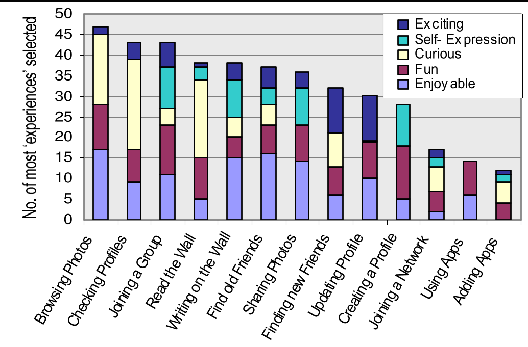
To solve this paradox, the team interviewed 26 users and observed their habits. They looked past the buttons and focused on the hedonic (pleasure-seeking) motivations of the users. They mapped these behaviors to Jordan’s Four Pleasures and McCarthy/Wright’s emotional frameworks.
Core Insights: Why Logic Loses to Emotion
The study identified four key pillars that made Facebook "sticky" despite its flaws:
1. The Power of "Page Stalking" (Curiosity)
The "News Feed" (a new concept at the time) acted as a massive trigger for curiosity. Users reported a "guilty pleasure" in "nosey" behavior—checking up on what friends were doing without a specific goal. This curiosity was a more powerful motivator than a clean UI.
2. Socio-Pleasure & Self-Expression
Facebook provided a platform for "Identification." Users weren't just checking a site; they were "proving they had a life" by uploading photos and updating statuses. The social reward of a "gift" or a "poke" (even if technically useless) created a positive emotional loop.
3. Serendipity and Evocation
The ability to find long-lost school friends (Serendipity) provided an emotional "high" that traditional utility-based websites couldn't match. Reconnecting with the past (Evocation) proved to be one of the most engaging features of the platform.
Critical Analysis & The Future of UX
The paper concludes that as technology moves from the office (utilitarian) to our pockets (social), our definitions of usability must change.
The Takeaway:
- Usability is not just about speed. It’s about how a product makes you feel.
- Friction can be okay. If the social reward is high enough, users will tolerate "clutter" and "inconsistency."
Limitations: The study was small (26 participants) and focused on a younger demographic. It also noted early warnings about Privacy, which would eventually become Facebook's greatest challenge. While users felt they could manage their data in 2008, the "open nature" of the platform was already creating underlying friction.
Conclusion
This work serves as a foundational reminder that in the world of Web 2.0 (and today's Algorithmic Web), Hedonic Quality—the fun, the curiosity, and the social connection—is the engine of growth. A "perfect" interface that provides no joy will always lose to a "messy" interface that makes us feel connected.