
Google+ Ripples: Making Information Flow Visible and Native
Google+ Ripples: A Native Visualization of Information Flow
Google+ Ripples is a "native" visualization tool integrated directly into the Google+ social network to represent the flow of public information. It utilizes a novel "balloon treemap" technique—a hybrid of circular treemaps and node-and-link diagrams—to visualize large-scale reshare cascades and URL diffusion in real-time.
TL;DR
Google+ Ripples was a pioneering attempt to bring professional-grade data visualization directly to social media users. It introduced the Balloon Treemap, a hybrid visualization capable of rendering thousands of "reshares" as intuitive, flowing ripples. By breaking away from traditional temporal axes, it revealed the hidden structures of virality—from the massive but shallow reach of celebrities to the deep, organic spread of viral "mega-hits."
The "Context Switch" Problem
Before Ripples, if you wanted to see how a post "went viral," you had to leave your social feed and use a third-party analytics tool. This context switch was a death knell for user engagement. Furthermore, visualizing information flow is mathematically messy:
- Bursty Data: Most shares happen in the first hour, making time-based X-axes look like a cluttered wall of dots.
- Branching Factor: One influencer can trigger 1,000 direct shares, which traditional "tree" diagrams cannot fit on a standard screen.
Methodology: The Balloon Treemap
The core innovation is the Balloon Treemap. The authors realized that neither standard node-and-link diagrams nor rectangular treemaps captured the "physics" of a conversation.
1. Heterogeneous Circle Packing
The algorithm doesn't treat every layer the same.
- At the top level, it uses a "big circles in the center" approach to highlight the heaviest influencers.
- At deeper levels, it reverses this: it places a "hole" of whitespace in the center and puts the biggest circles on the outside. This prevents labels from overlapping and makes the hierarchy readable even when zoomed out.
2. Directional "Flow" Optics
To solve the aesthetic "unreadable mess" of overlapping arrows, the authors used:
- Curved Paths: Smooth arcs instead of jagged lines to imply fluid movement.
- Centroid Rotation: Groups of shares are rotated to point "outward" from their parent, maximizing the visual metaphor of a ripple expanding in a pond.
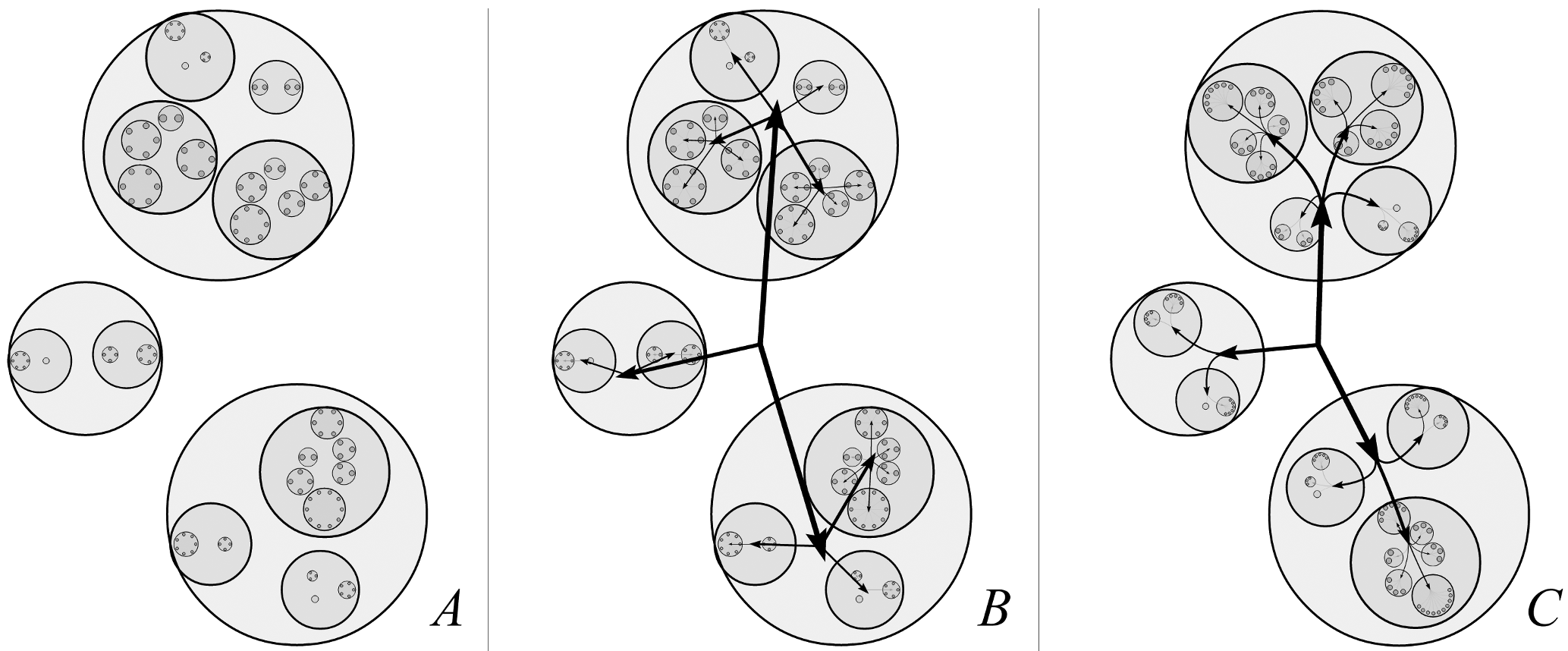 Figure: The evolution of directionality treatment, from no arrows to curved, flow-aligned paths.
Identifying Patterns of Virality
By deploying this natively, the researchers identified distinct archetypes of how information survives in the wild:
- The Celebrity Spike (Broad but Shallow): Posts by stars like Selena Gomez generate massive volume instantly, but the "chains" are short. People see it, share it once, and it dies. There is no "secondary" spark.
- The Organic Viral (Heterogeneous): Content like the "Dollar Shave Club" video shows a "forest" of deep trees. It doesn't just rely on one source; it jumps between communities, creating chains 8+ levels deep.
- The Distributed Forest: Some URLs spread without a single dominant leader, suggesting a "headless" virality where many small initiators drive the trend.
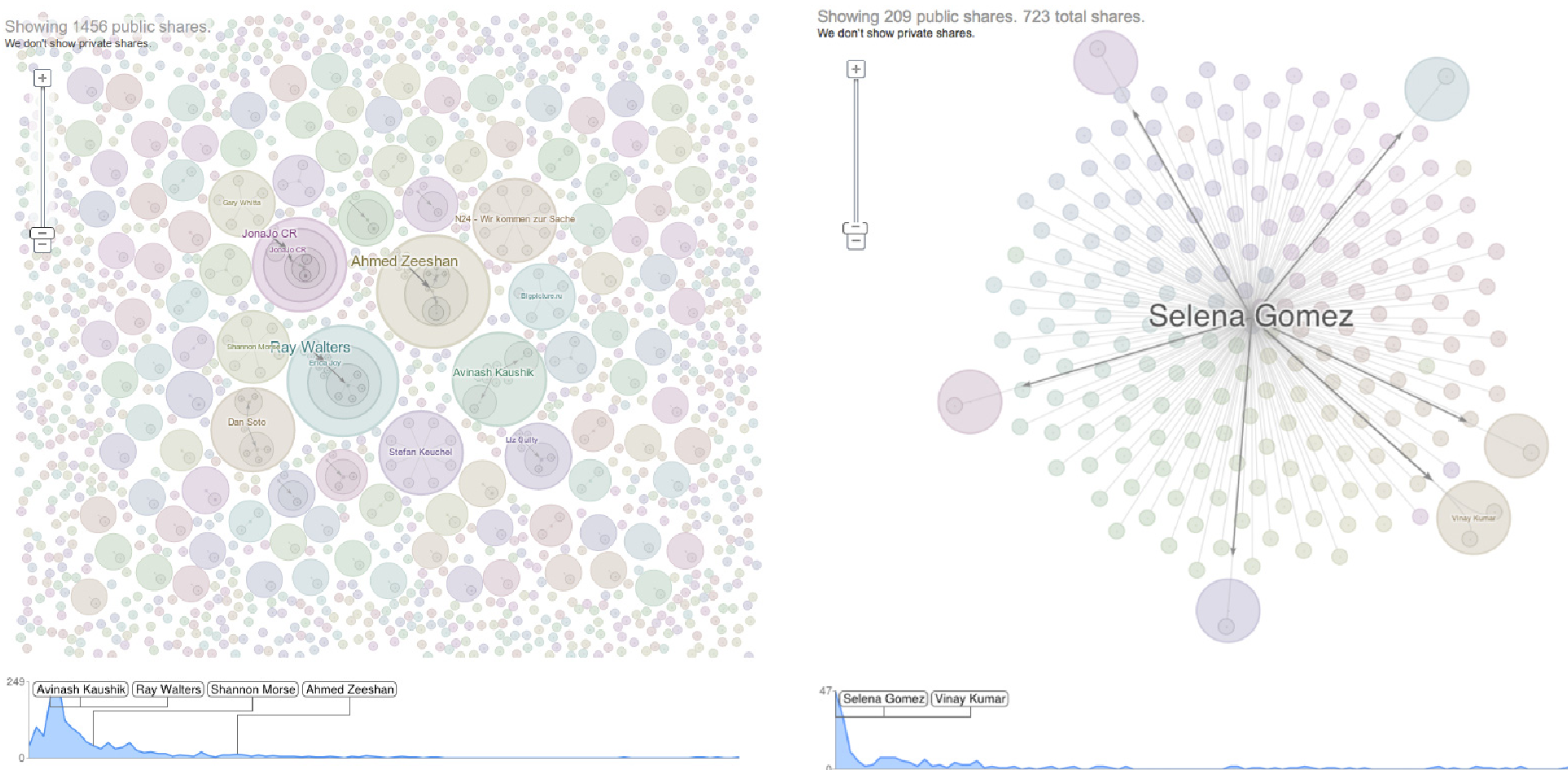 Figure: Comparing the "Broad forest" (left) where many people start deep conversations, with the "Celebrity pattern" (right) which is broad but lacks depth.
Critical Insight: Aesthetics as Utility
One of the paper's most salient points is that aesthetics matter for "actionable" data. While some professional analysts initially viewed the "ripple" look as "fancy," they eventually found that the spatial layout allowed them to identify "key amplifiers" (influencers) faster than a spreadsheet ever could.
The transition from V1 (tracking one post) to V2 (tracking a whole URL/forest) proved that users wanted to see the entire ecosystem of a link, not just their own small corner of it.
Deep Insight & Conclusion
Google+ Ripples was more than a UI feature; it was a study in Social Data Analysis. It proved that:
- Scale requires Level-of-Detail (LoD): To keep animations smooth, the system renders only prominent features during movement and cross-fades to high-res once static.
- Transparency is Privacy: By only visualizing public posts, the tool circumvented the "creepy" factor while still providing deep insights.
Future Outlook: While Google+ is gone, the lessons of Ripples—using "Balloon Treemaps" to visualize the geometry of influence—remain a benchmark for any platform attempting to make sense of the chaotic "ripples" of the modern internet.