
Human-Mobile Interaction in Healthcare: Reducing Medical Errors through HCI-Driven Design
Mapping HCI Principles to Design Quality of Mobile User Interfaces in Healthcare Applications
This paper presents a framework for mapping fundamental Human-Computer Interaction (HCI) principles to a specialized quality measurement model (QiU-4-MUI) for mobile healthcare applications. Through a controlled experiment with 23 medical professionals, it demonstrates that adhering to principles like Mental Models and Affordance significantly improves the "quality-in-use" of mobile medical interfaces compared to traditional desktop systems.
TL;DR
In the high-pressure world of healthcare, a poorly designed mobile interface isn't just an annoyance—it's a clinical risk. This research introduces a methodology to bridge the gap between abstract HCI Principles (like Affordance and Visibility) and concrete Quality-in-Use metrics. By testing the Phoenix Health Information System (PHIS2) on doctors, the authors proved that mobile interfaces designed with strict HCI mapping significantly outperform desktop versions in error safety and cognitive efficiency.
The High Stakes of Mobile UX in Hospitals
Mobile devices are ubiquitous in hospitals, yet a staggering 22% of apps are abandoned after a single use, often because they fail to respect the user's workflow. In healthcare, the "Quality-in-Use" (QiU) is paramount: a doctor's primary focus is the patient, not the screen. Prior work often treated usability as a vague "feeling," but this paper treats it as a measurable engineering requirement to prevent "killing patients through bad design."
The Framework: Mapping Theory to Performance
The core contribution of this work is the explicit mapping of HCI Principles to QiU-4-MUI Characteristics. The authors argue that quality isn't an accident; it's a direct result of specific design choices:
- Mental Model → Effectiveness: Utilizing existing knowledge (e.g., standard symbols for Lab/Radiology) helps doctors complete tasks with fewer actions.
- Affordance → Productivity: Clearly identifying functionalities (knowing where to tap) reduces the time taken to complete tasks.
- Visibility → Efficiency: Making the current system state clear (e.g., active vs. inactive tabs) increases speed.
- Feedback → Error Safety: Confirmed responses to actions prevent the "double-tap" or "wrong-selection" errors that lead to medical mishaps.
- Metaphor → Cognitive Load: Using familiar medical symbols acts as a mental shortcut, reducing the "brain power" required to navigate.
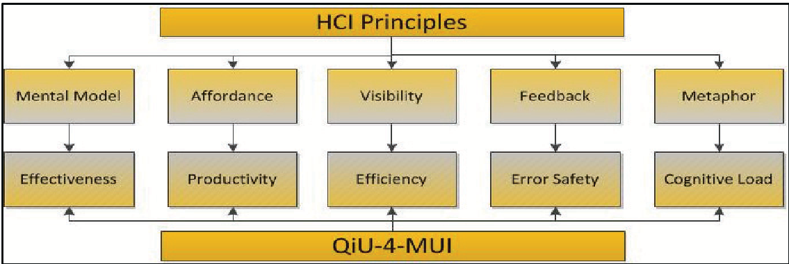 Figure 1: The resulting mapping between HCI principles and quality-in-use characteristics.
Methodology & Experimental Evidence
The researchers didn't just propose a theory; they performed a controlled experiment with 23 junior doctors at King Abdulaziz University Hospital.
The App: PHIS2-M
Designed for the iPhone, the app implemented specific guidelines:
- Pharmacy Order Views: Highlighted recent results in yellow (Feedback).
- Search: Dynamic display of words starting with the same letter (Effectiveness).
- Navigation: Familiar medical symbols to reduce cognitive load.
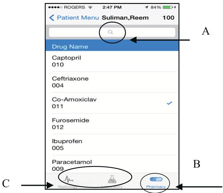 Figure 2: Example of the Pharmacy Order view incorporating HCI feedback principles.
Key Quantitative Results
Using the paired Student t-test, the study compared a desktop UI (PHIS2-D) and the mobile UI (PHIS2-M).
| Characteristic | Outcome | Metric Improvement |
|---|---|---|
| Effectiveness | Mobile Better | Minimized actions per task |
| Productivity | Mobile Better | Higher actions per second |
| Error Safety | Mobile Better | Fewer errors per action |
| Cognitive Load | Mobile Better | Minimized actions per view |
Deep Insight: Why Mobile Won
One might assume a large desktop screen is always better for complex medical data. However, the study reveals a "Less is More" paradox:
- Constraint-Driven Clarity: The limited screen real estate of a smartphone forces designers to adhere to HCI principles like Visibility and Simplicity.
- Cognitive Offloading: By using mobile-specific metaphors and affordances (like tab views for different departments), the interface mirrors the doctor's mental "checklist," reducing the overhead of sorting through nested menus found in desktop software.
Critical Analysis & Future Outlook
While the study provides robust empirical evidence, it is limited by its focused sample (23 doctors) and specific "junior" stereotype. Future research should investigate if these principles hold for "power users" (senior consultants) or across different cultural contexts.
The Bottom Line: This research provides a "Rosetta Stone" for mobile developers. If you want to build a safe, efficient medical app, you cannot start with code; you must start by mapping the user's mental model to the interface's affordances.
Reference: Alnaniha, R., & Ormandjievab, O. (2016). Mapping HCI Principles to Design Quality of Mobile User Interfaces in Healthcare Applications. MobiSPC.