
Decoding Sociograms: Why Your Social Network Layout Matters More Than the Data
How people read sociograms: a questionnaire study
This paper presents an empirical user study on sociogram perception, evaluating how five visualization conventions and edge crossings affect human understanding. By combining quantitative performance data with qualitative questionnaires, the authors identify key layout principles that influence how people perceive actor importance and group structures in social networks.
TL;DR
A social network is more than just a list of connections; it is a visual story. This seminal study by Huang et al. reveals that how you arrange nodes—whether in a circle, a hierarchy, or clusters—fundamentally changes what people perceive. While we often obsess over "minimizing edge crossings," this research proves that positioning is king when it comes to social importance, and clustering is vital for group identification.
The Perception Gap: Why Aesthetics Aren't Everything
In the world of Graph Drawing, there is a golden rule: Minimize Edge Crossings. The intuition is simple—crossings create "noise" and make paths harder to trace.
However, social networks (Sociograms) are unique. We don't just look at them to find the shortest path; we look at them to find the "boss" or the "clique." The authors argue that general graph aesthetics might be irrelevant to these specific social tasks. They set out to bridge the gap between algorithmic efficiency and human cognitive reality.
Methodology: Testing the "Visual Accent"
The researchers mapped the same auditing team network using five different "conventions":
- Circular: Nodes on a ring; meant to show patterns but lacks a focal point.
- Radial: Central nodes in the middle; theoretically highlights status.
- Hierarchical: Status mapped to vertical coordinates (top is "higher").
- Group: Clusters nodes together to show cliques.
- Free: Standard force-directed layout focusing on readability.

Key Insights: How We Actually Read Networks
1. The "Top-is-Best" Bias
The study found a massive preference for Hierarchical Layouts when identifying important people. Even if the data didn't change, users instinctively felt that nodes at the top or in the absolute center were the "leaders." Interestingly, edge crossings—usually the enemy of graph drawing—didn't hinder this task because users focused on the arrows immediately surrounding the node rather than tracing long paths.
2. Grouping Overcomes Noise
For identifying cliques, the Group Layout was the undisputed winner. A fascinating qualitative finding: in group layouts, users actually liked some crossings within the group. Why? Because dense crossings within a cluster created a visual "texture" of high connectivity, making the group feel more cohesive.
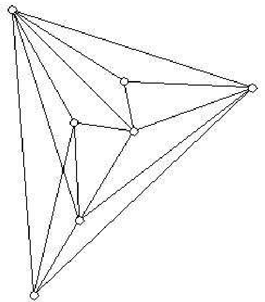 (Left: Clean Group; Right: Dense Crossings in Group - the latter suggests a more "tight-knit" team to the human eye).
Designing Better Sociograms: A Practical Checklist
Based on the questionnaire results, the authors propose a set of "Heuristics for Human-Centric Design":
- Position matters: Place the most important nodes at the top or center. Don't let your algorithm place a CEO at the bottom corner just to reduce a crossing.
- Distance is Meaning: Keep edges shorter between closely related actors. Users naturally assume physical proximity equals social proximity.
- Directional Consistency: Align arrows in a similar direction. Mixed directions increase "visual friction."
- Task-Specific Layouts: Use Group layouts for community detection and Hierarchical layouts for power-structure analysis.
Critical Analysis & Conclusion
This paper serves as a vital reminder for Data Scientists and UX Designers: Human intuition is an Inductive Bias. We do not read graphs like computers do. We bring our habits of reading (top-to-bottom, left-to-right) and our social instincts (leaders are central) to the screen.
Limitations: The study used a small network (auditing team). As we move into the era of "Big Data" with thousands of nodes, these rules might shift. In a massive hairball graph, can hierarchical positioning still be perceived? Probably not without zooming and filtering.
Future Work: The authors suggest using eye-tracking to see where fixations land. If a user spends the first 200ms looking at the top-center regardless of the data, then "Top-Center" is the most valuable real estate in your visualization.
Final Takeaway: To communicate network data effectively, you must choose a layout that aligns with your audience's mental model, not just one that looks "neat" to an algorithm.