
Beyond Text Settings: A Visual Approach to Personal Privacy on Social Networks
Interaction and Visualization Design for User Privacy Interface on Online Social Networks
The paper proposes a novel visual model and privacy controller for Online Social Networks (OSNs) to mitigate accidental data leakage. By utilizing a radar-chart-based interface to represent five privacy dimensions (Who, What, When, Where, Whom), it aims to move beyond boring text-based settings to enhance user awareness and understanding.
TL;DR
In the era of exploding online information, traditional text-based privacy policies are failing users. This paper introduces a radar-chart-based Privacy Object that visualizes the "surface area" of your data exposure across five dimensions: Who, What, When, Where, and Whom. It moves privacy from a legal checkbox to an intuitive, interactive experience.
Positioning: This work is a UI/UX-centric intervention in the field of Usable Privacy and Security, bridging the gap between technical access control and human behavioral psychology.
The "Awareness-Understanding" Gap
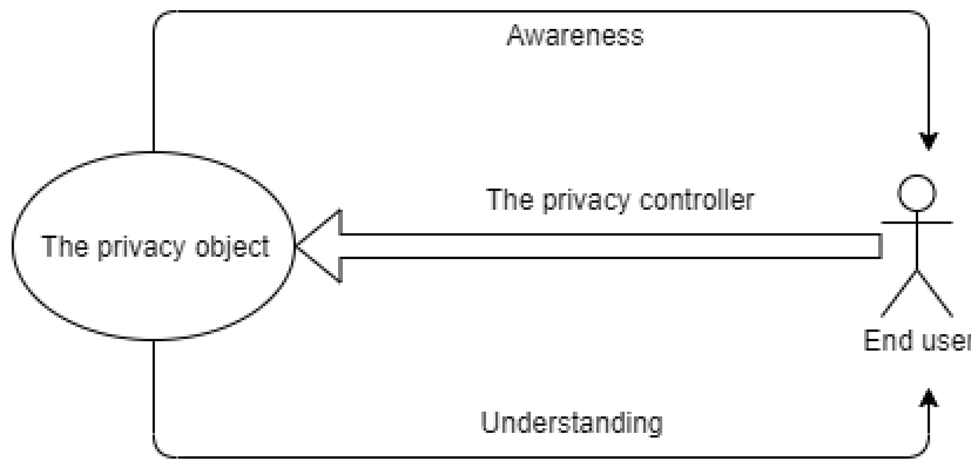
Why do we keep sharing things we shouldn't? The authors argue it's not a lack of technology, but a lack of Awareness and Understanding.
- Awareness: Knowing that a choice exists and what its immediate consequences are.
- Understanding: Being able to evaluate choices against personal objectives.
Most OSNs prioritize business growth (encouraging sharing) over protection, leading to interfaces that make it too easy to "Share with Public" and too hard to audit one's privacy footprint.
Methodology: The 5D Privacy Radar
The core innovation lies in treating a "Share" as a Privacy Object with five quantifiable dimensions:
- Who: Number of people tagged or affected.
- What: Sensitivity of the content (PII vs. public links).
- When: Temporal accuracy (Instant sharing vs. delayed).
- Where: Location accuracy (GPS coordinates vs. city level).
- Whom: The size and nature of the target audience.
1. Visualizing the Risk
Instead of dropdown menus, users interact with a Radar Chart. The larger the area of the polygon, the higher the leakage risk.
2. The Asymmetric Privacy Controller
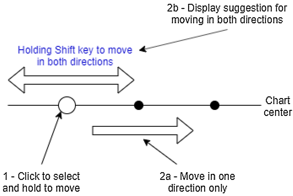
Borrowing from Soft Paternalism, the authors designed a "sluggish" interface for risky actions.
- Default to Safety: Initial values are always the least exposed.
- Friction for Risk: Moving a data point outward (increasing exposure) requires more physical effort—specifically, holding down the
Shiftkey—whereas moving it inward is seamless.
Experimental Validation
Using a simulated Facebook environment, the team tested the model against 15 volunteers.
Key Findings:
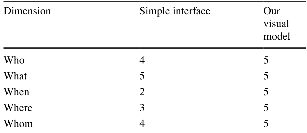
- Recognition Bloom: On the traditional interface, users frequently missed changes in "When" and "Where" settings. With the radar chart, recognition jumped to 100% because the visual shape changed dramatically.
- Speed vs. Insight: While text remains necessary for fine-tuned details (e.g., "Friends" vs. "Public"), users reported that the visual area gave them an "instant gut feeling" about their safety that text couldn't provide.
Critical Insight & The "Business" Bottleneck
The authors candidly admit a major hurdle: Business Intent. Social media giants thrive on data sharing. A tool that makes it "harder" to share publicly and visualizes the "scary" area of exposure might be effective for users, but it's technically anti-growth for the platform.
Future Outlook: The next step for this research is to move beyond arbitrary axis lengths. Not all dimensions are equal—losing your Social Security Number (What) is far worse than sharing your city (Where). Weighting these axes based on context-aware risk will be the key to making this model production-ready for the next generation of privacy-first social platforms.
Conclusion
This paper serves as a vital reminder that Privacy is a UX Problem. By translating abstract data permissions into a physical "area of risk," we can empower users to reclaim control over their digital lives—one radar chart at a time.