
Beyond the Scatterplot: Visualizing YouTube’s Multidimensional Social Network with GPLOM
Interactive Exploration of Multidimensional YouTube Data Using the GPLOM Technique
This paper presents a web-based implementation of the Generalized Plot Matrix (GPLOM) technique specifically designed for the interactive exploration of multidimensional YouTube datasets. By integrating scatterplots, bar charts, and heatmaps into a unified matrix, the tool enables the simultaneous analysis of quantitative and categorical attributes of video metadata.
Executive Summary
TL;DR: The paper "Interactive Exploration of Multidimensional YouTube Data Using the GPLOM Technique" introduces a sophisticated web-based tool that solves the "heterogeneous data problem" in visualization. By leveraging Generalized Plot Matrices (GPLOM), the authors allow users to simultaneously analyze categorical data (video genres) and quantitative data (view counts, lengths) through a unified, interactive interface.
Positioning: This work is an application-focused implementation that bridges the gap between theoretical visualization frameworks (like those proposed by Im et al.) and practical social media analytics.
Problem & Motivation: The Mixed-Data Dilemma
In the era of social media, data is rarely uniform. A YouTube video is defined by its length (quantitative), its category (categorical), its star rating (binned/categorical), and its engagement metrics (quantitative).
Standard Scatterplot Matrices (SPLOM) fall short here because they cannot naturally represent a "Category vs. Ratings" relationship. Usually, researchers are forced to use separate charts—a bar chart here, a scatterplot there—which breaks the cognitive flow. The authors' insight was to implement a GPLOM because it treats the "cell" of a matrix as a polymorphic container that adapts its visualization type based on the axes it represents.
Methodology: The Core Architecture
The researchers built their tool using D3.js, creating a matrix of 15 primary cells. The technical brilliance lies in the Coordinated Multiple Visualization approach:
- Adaptive Cells:
- Scatterplots: Quantitative (x) vs. Quantitative (y).
- Bar Charts: Categorical (x) vs. Quantitative (y).
- Heatmaps: Categorical (x) vs. Categorical (y).
- Interaction Design: They utilized Focus + Context techniques. When a user hovers over a category, the system uses hue-based highlighting (turning elements red) and desaturates non-relevant data. This prevents "information overload" in a dense matrix.
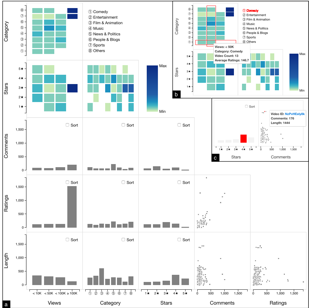 Figure 1: The GPLOM Interface demonstrating linked views and tooltip details.
Experiments & Results: Uncovering Hidden Patterns
The study analyzed a dataset of 202 YouTube videos. By "sorting" the matrix and using the interactive filters, the authors discovered several non-obvious correlations:
- The 100k Threshold: Total ratings and comments generally grow with views, but once a video hits 100k views, ratings spike at a much higher rate than comments. This suggests a shift in user behavior from active discussion to quick feedback at higher scales.
- Length vs. Quality: A counter-intuitive finding was that longer videos tend to have fewer views but higher overall star ratings, suggesting that niche, long-form content often satisfies its audience more effectively than viral short-form clips.
- The "News" Paradox: "News and Politics" generates the most engagement (comments) but rarely achieves a 5-star average, indicating the divisive nature of the category.
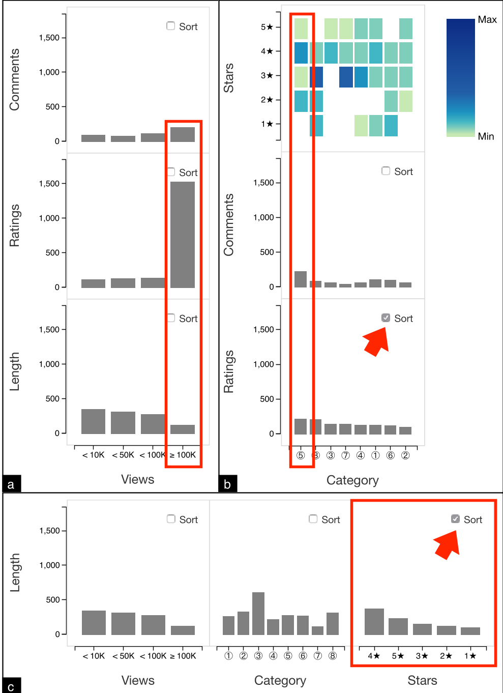 Figure 2: Analysis of engagement trends across different video attributes.
Critical Analysis & Conclusion
Takeaway
The GPLOM technique is a superior alternative to standard matrices when dealing with real-world datasets that are "messy" and multidimensional. It provides a global view of the data while allowing for local deep-dives.
Limitations
- Scalability: The current implementation handles 202 videos. On a dataset with 100,000+ points, the scatterplots would suffer from significant overplotting, and the heatmaps would become unreadable without further aggregation or sampling.
- Cognitive Load: For an untrained user, a 15-cell matrix with three different types of charts can be overwhelming.
Future Work
The authors intend to test this framework on larger datasets and perhaps integrate automated "insight detection" to guide the user to the most interesting cells in the matrix automatically.