
The Clyph: Deciphering Big Data Events through Multiscale Spatiotemporal Visualization
A multiscale approach to network event identification using geolocated twitter data
This paper introduces a multiscale visual analysis system for identifying social network events using geolocated Twitter data. The core innovation is the "Clyph," a novel aggregation glyph that integrates spatial, temporal, and quantitative data into a single intuitive representation, enabling real-time exploration of big data on maps.
TL;DR
Researchers have developed a "multiscale" visualization framework designed to turn the chaotic noise of Twitter streams into identifiable real-world events. By introducing the Clyph—a specialized clock-based glyph—the system aggregates thousands of tweets into intuitive visual summaries that reveal the "where," "when," and "how much" of social activity without the typical clutter of big data maps.
Problem & Motivation: The "Hairball" of Social Data
As social networks grew, the ability of humans to monitor them in real-time diminished. Traditional visualization techniques struggled with three dimensions:
- Spatial Overlap: Too many points in one city make the map unreadable.
- Temporal Depth: Events happen at different scales (a 2-hour game vs. a 3-day festival).
- Information Loss: Removing raw data to clear up the view often hides the very "anomalies" researchers are looking for.
The authors' insight was to move away from "plotting points" and toward statistical aggregation that uses a familiar metaphor—the clock—to represent time.
Methodology: The Architecture of a Clyph
The system relies on a two-step process: spatial aggregation and visual encoding.
1. Greedy Spatial Aggregation
To handle multiple scales (from state-wide to street-level), the system uses a greedy algorithm to cluster tweets. It selects a random tweet, groups all others within a specific radius into a single glyph, and repeats until the map is covered with non-overlapping representatives.
2. The Clyph Anatomy
The Clyph itself is a masterclass in information density. Instead of showing every tweet (which creates visual noise), it uses:
- The Clock Metaphor: A 24-hour circular layout.
- Statistical Tiers: A red line for the Median time, an orange sector for Quartiles, and a green sector for the total Range.
- External Notches: Small marks on the perimeter indicating the number of tweets and their relative spatial direction or exact time.
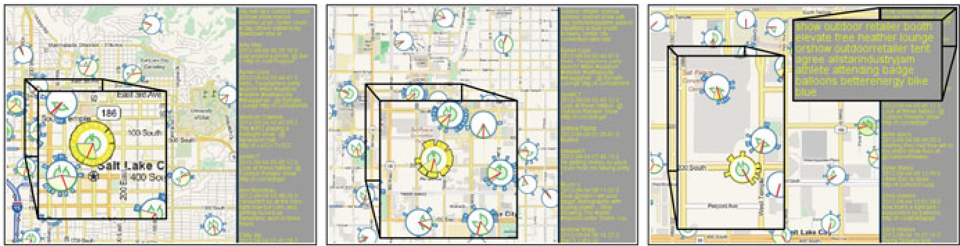 Figure 1: Multiscale exploration from city-wide overview to event localization.
Experiments & Results: Spotting Real-World Patterns
The researchers tested their tool on nearly 200,000 tweets from Utah in August 2012. Several case studies proved the Clyph's effectiveness:
- Short-term Events (Soccer Game): A sharp spike in per-clyph activity and a tight temporal range (17:00–22:00) clearly marked a Real Salt Lake game at the stadium.
- Wide-spread Events (First Day of School): Increased activity across the entire University of Utah campus revealed not just a single point, but a synchronized movement of students (with a distinct "lunch break" gap in the data).
- Multi-day Events (Arts Festival): The system captured the "rhythm" of the Park City Arts Festival, showing peaks in activity between 12:00 and 18:00 over several days.
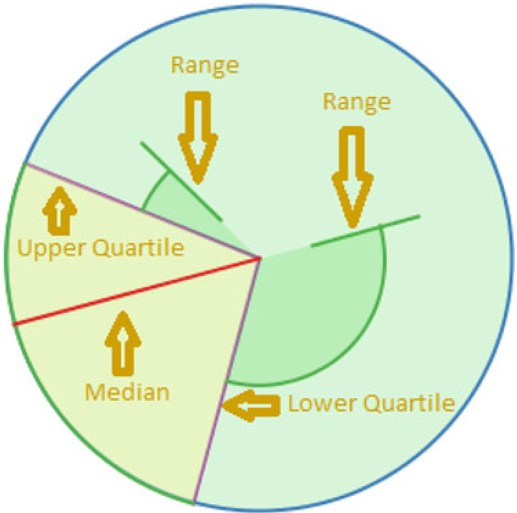 Figure 2: The Clyph uses median (red), quartiles (orange), and range (green) to convey a temporal story without plotting individual data points.
Critical Analysis & Future Outlook
Takeaway
The Clyph succeeds because it respects the cognitive load of the user. It provides a hierarchical summary that allows for broad scanning and deep diving into textual content through a linked interface.
Limitations
- Gaussian Assumption: The current statistical model assumes a single "peak" of activity per glyph. If two different events happen at the same location at different times, the median might represent a "dead zone" between them.
- Visual-Only Mining: The system still requires a human to "spot" the anomaly.
Future Work
The next step for this technology lies in Hybrid Intelligence: using machine learning to flag "interesting" Clyphs automatically, allowing users to move from "searching for events" to "verifying detected events." As we move into the era of hyper-local data, these multiscale abstractions will be vital for making sense of our "Digital Twin" cities.
Conclusion
By combining classic cartography with statistical temporal plots, the authors have turned Twitter from a firehose of noise into a structured lens for urban sociology.