
Animating the Social Pulse: High-Density Visual Analytics for Dynamic Networks
Cell phone Mini Challenge: Node-link animation award animating multivariate dynamic social networks
The paper presents a specialized visual analytics tool developed for the VAST 2008 Mini Challenge to analyze multivariate dynamic social networks. By integrating animated matrix representations and force-directed node-link diagrams, the tool successfully identifies structural changes and key actors within a 10-day phone call dataset.
TL;DR
Addressing the VAST 2008 Mini Challenge, this paper introduces a specialized visualization suite that leverages animated matrices and force-directed node-link diagrams to track temporal shifts in social networks. By using intelligent "color decay" and geographic anchoring, the tool transforms static phone logs into a dynamic narrative, identifying key social actors and structural equivalences.
Background & Positioning
In the landscape of Social Network Analysis (SNA), time has often been treated as a discrete sequence of static "snapshots." This work acts as a bridge between traditional graph theory and modern Dynamic Network Visualization, moving away from static tools like Pajek and toward a more fluid, interactive medium that emphasizes movement and temporal persistence.
The Problem: The Temporal Blind Spot
When analyzing social networks—such as the 10-day phone call activity provided in the VAST 2008 challenge—analysts face a "data density" dilemma. Static graphs become "hairballs" as edges accumulate over time, while manual slideshow transitions make it impossible to track how specific groups migrate or transform. The authors identify a critical gap: the lack of support for simultaneous multivariate visibility (location, time, and hierarchy) in a dynamic context.
Methodology: High-Density Matrix & Animated Nodes
The tool relies on two primary coordinated views:
1. The Dense Pixel Matrix
Unlike traditional matrices that struggle with scale, this tool uses a 2x2 pixel square for each edge. This allows a 400-node graph to fit comfortably within an 800x800 display area.
- Color Decay: To handle the time dimension, the authors implemented a decay function. New calls appear bright, while inactive edges fade into the background. This creates a visual "heat map" of recent activity, allowing latecomers or sudden spikes in communication to "pop" out of the overview.
2. Force-Directed Node-Link Animation
For detailed analysis, the tool uses a force-directed layout where nodes are not just abstract points but are anchored by:
- Geographic Hidden Nodes: Locations act as gravitational centers, pulling actors toward their physical cell tower locations.
- Structural Equivalence Detection: By watching how nodes move towards common neighbors over time, analysts can visually spot when a new group of people begins to replace an old coordination hierarchy.
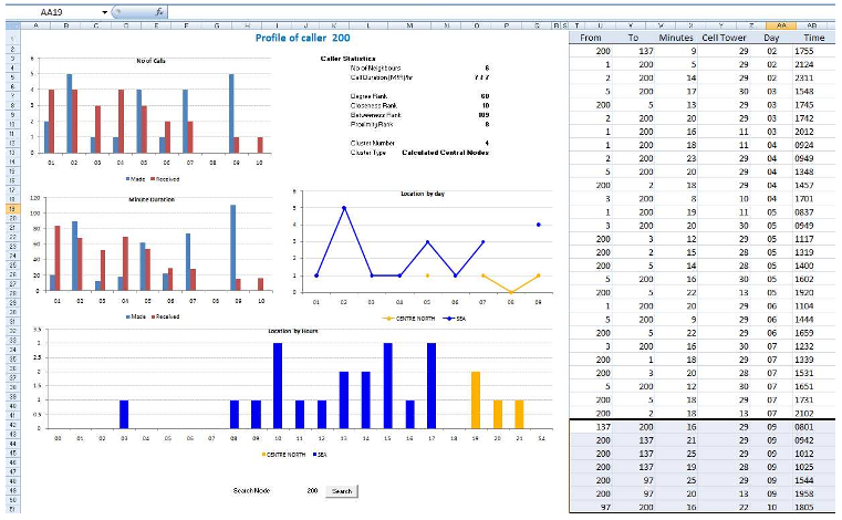 Figure 1: The progression from Day 5 (left) to Day 10 (right) highlights how a new set of nodes (latecomers) migrates toward the center of established network activity.
Experiments and Insights
The authors validated their tool by solving the VAST challenge scenario. The matrix view acted as a filter, highlighting a specific group of very active latecomers. Transitioning to the node-link view (facilitated by the Processing-based engine), they observed these latecomers moving towards nodes that were previously central to the network—a clear indicator of structural equivalence.
The integration with Microsoft Excel (serving as an external data repository) provided a secondary screen for attribute-level filtering. This "dual-monitor" strategy represents an early but effective approach to the multi-modal data exploration problem.
Critical Analysis & Conclusion
Takeaway
The most valuable contribution of this paper is the parameterized decay approach. By allowing the user to adjust how long an edge persists in the visual field, the tool accommodates different cognitive loads and analysis speeds.
Limitations
- Scalability: While 400 nodes were handled effectively, the 2x2 pixel matrix approach eventually hits a hardware resolution limit.
- Subjectivity: Selecting the "right" decay parameter is currently manual and subjective. If the decay is too fast, the analyst loses history; if too slow, the display becomes a "hairball."
Future Outlook
The authors suggest that future systems should automate parameter tuning—suggesting decay rates based on the data's inherent frequency. Looking at modern AI-driven analytics, this work serves as a precursor to automated anomaly detection in temporal graphs, where the visualization acts as the "human-in-the-loop" interface for complex social forensics.