
Beyond Passive Consent: Redesigning Privacy Dialogues for the Social App Era
An online experiment of privacy authorization dialogues for social applications
This paper presents an experimental study on redefining privacy authorization dialogues for third-party social applications, introducing four novel designs (C, CAA, CS, CSAA) based on Fair Information Practice Principles (FIPPs). The research demonstrates that enhancing interface awareness and providing installation-time configuration significantly improves user control and reduces the unauthorized release of sensitive personal data on platforms like Facebook.
TL;DR
Researchers from Pennsylvania State University have challenged the "illusion of control" in social networking sites. By redesigning Facebook's third-party app authorization dialogues using Fair Information Practice Principles (FIPPs), they found that granular checkboxes and visual warning signals can move users from mindlessly clicking "Allow" to actively protecting their sensitive data. The study saw app installation rates drop by over 20% when users were properly informed of the risks.
The Problem: The "Take-it-or-Leave-it" Trap
For years, social media users have been trapped in a binary choice: accept an app's invasive data demands or don't use the app at all. Existing interfaces were criticized for being:
- Opaque: Users couldn't distinguish between an app "reading" data vs. "publishing" to their wall.
- Reactive: Control settings were buried deep in menus, only accessible after the data had already been harvested.
- Ineffective: High-speed, low-awareness clicking became the norm, leading to massive exfiltration of personal IDs and friend lists.
Methodology: The "Wizard of Oz" Extension
To test their hypotheses, the team developed four distinct interface designs (summarized below) and deployed them using a sophisticated Chrome browser extension. This allowed them to perform a legal "man-in-the-middle" modification of Facebook's HTML DOM, giving participants a realistic experience with their own accounts.
The Four Design Variants:
- C (Check-box): Granular opt-out options for specific data categories at installation time.
- CAA (App-Activity): Adds a toggle for who can see your app usage (e.g., "Only Me").
- CS (Signal): Introduces color-coded "i" marks—blue for required data, red for sensitive data (like email or birthday).
- CSAA (The Full Suite): Combines all the above elements to maximize awareness and control.
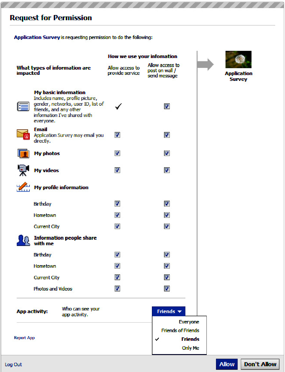 Above: The CAA design featuring the granular layout and the app activity visibility drop-down.
Key Insights: Why These Designs Work
The study’s data suggests that the "How" of privacy is just as important as the "What":
1. Slowing Down the User
While the baseline Facebook interface took users only 9 seconds to navigate, the redesigned interfaces took 28 seconds. This "productive friction" allows the brain to transition from automatic browsing to critical evaluation.
2. The Power of the Red Signal
One of the most striking findings was the effectiveness of the Red "i" mark. When sensitive information (Social Security predictors like birthdates and hometowns) was flagged, users were significantly more likely to abandon the installation or opt-out of those specific data points.
3. Granularity Reduces Information Leakage
Even when users chose to install the app, they didn't just accept the defaults. In the C and CAA designs, users opted out of publishing permissions and specific data access points consistently, proving that users want to negotiate their privacy when given the tools.
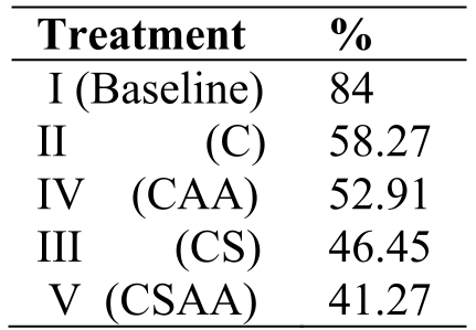 Table showing the significant drop in information release frequency as design complexity and awareness signals increase.
Critical Analysis & Future Outlook
While the results are promising, the authors acknowledge a few hurdles:
- Warning Fatigue: Would users eventually ignore the red signals if every app used them?
- Incentive Alignment: Why would a platform like Facebook want to implement a design that lowers app installation rates?
The value of this paper lies in its Front-End Empowerment. By focusing on the moment of "Notice and Consent," the authors provide a blueprint for what a privacy-first web might look like. For developers and UI/UX designers, the takeaway is clear: transparency doesn't just inform users—it changes their behavior.
Conclusion
This work serves as a foundational piece in Human-Computer Interaction (HCI) and digital privacy. It proves that the "apathy" often attributed to users regarding their privacy is, in fact, a symptom of poor interface design. When given the agency to choose, users choose protection.