
Decoding Democracy: Using Neural Maps to Unmask Political and Economic Realities
Analysis of Parliamentary Election Results and Socio-Economic Situation Using Self-Organizing Map
This paper applies the Self-Organizing Map (SOM) algorithm to analyze Finnish parliamentary election results from 1954 to 2003, correlating them with socio-economic indicators. By mapping electoral shifts and economic variables concurrently, the study identifies non-linear relationships and historical patterns that traditional statistical models often overlook.
TL;DR
Researchers Pyry Niemelä and Timo Honkela leverage Self-Organizing Maps (SOM) to visualize 50 years of Finnish political history. By treating election results as high-dimensional data points, they've uncovered "political gravity" — the invisible forces where economic variables like inflation and unemployment pull and push voter loyalty across decades.
Background: This study sits at the intersection of Machine Learning and Computational Social Science, moving away from "guess-and-check" hypothesis testing toward an exploratory, data-first visualization of democracy.
The "Curse" of Linear Political Science
In political science, the "What happened?" is usually easy to see, but the "Why?" is often buried under dozens of variables. Traditional statistics often look at one thing at a time: Does unemployment affect the incumbent? While useful, this misses the latent manifold of politics—the way inflation, party history, and voter burnout interact simultaneously.
The authors argue that traditional linear models are too rigid for the "turbulent" nature of societal shifts, especially during periods like the 1990s economic recession in Finland.
Methodology: Mapping the Political Landscape
The core of this research is the Self-Organizing Map (SOM), a type of unsupervised artificial neural network. It takes 33 variables—including the vote shares of 9 parties, unemployment rates, and GDP changes—and squashes them into a 2D "map" where similar years are placed close together.
Data Breakdown:
- Electoral Data: 1954–2003 (11 variables).
- Economic Conditions: Inflation (COLI), Unemployment (UNEM), GDP growth, and Consumption (12 variables).
- Governance: Whether a party was in power or opposition (10 variables).
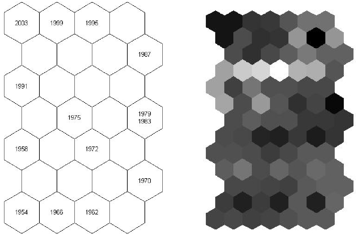 The distance map above shows the "chain" of Finnish history. Notice how consecutive election years tend to cluster, reflecting the gradual nature of societal evolution—until a "jump" occurs during a crisis.
Key Insights: The Price of Power
The study’s visualization through Component Planes (variable maps) allowed the authors to spot patterns that would be invisible in a spreadsheet.
1. The "Incumbency Trap"
The investigation confirmed a brutal reality for major Finnish parties: Being in government is a popularity death sentence. For the KESK, SDP, KOK, and LEFT parties, there was a visible trend of "incumbency fatigue" where voters consistently penalized whichever party carried the weight of governance in the subsequent election.
2. The Great Turnout Shift
One of the most striking findings was the change in voter behavior regarding economic growth.
- 1950s-60s: Economic growth correlated with higher turnout (wealth enabled political participation).
- 1990s-2000s: Economic growth correlated with lower turnout (wealth seemed to breed political apathy or negligence).
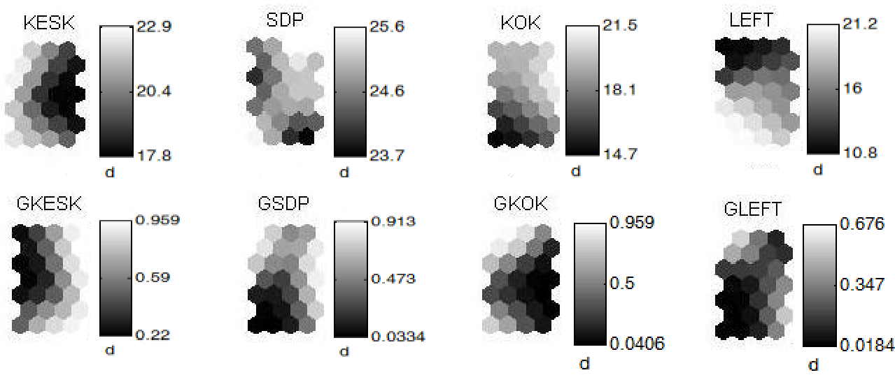 These component planes show the spatial distribution of variables like inflation and party popularity. Areas with dark shades indicate high values, facilitating instant visual correlation between, for example, high unemployment and low voter turnout.
Critical Analysis & Conclusion
This paper proves that the Self-Organizing Map is more than just a clustering tool; it is a "visual hypothesis generator."
Takeaways:
- Methodological Value: The SOM bridges the gap between the "feel" of qualitative history and the "rigor" of quantitative data.
- Limitations: While the SOM shows where things are related, it doesn't prove causality. The authors admit that specific historical context (like the collapse of the USSR in 1991) provides the necessary "why" that the map only hints at.
- Future Work: The logical next step is adding more granular data—perhaps social media sentiment or local-level regional data—to see if these macro-trends hold true at the micro-level.
In an era of political polarization, tools that allow us to step back and see the "big picture" of societal movement are more vital than ever.