
Parody in Place: Unmasking the "God Trick" of Data-Driven Mapping
Parody in Place: Exposing Socio-spatial Exclusions in Data-Driven Maps with Design Parody
The paper introduces "Parody in Place," a design research project featuring "Dork Posters"—a satirical brand that imitates popular typographic neighborhood maps. By populating these maps with data from Yelp, Zillow, and Car2Go, the authors expose socio-spatial exclusions and challenge the perceived neutrality of algorithmic mapping in Seattle.
TL;DR
Researchers from the University of Washington created Dork Posters, a parodic design firm that imitates the sleek aesthetic of modern typographic maps. By replacing simple neighborhood names with data filtered through Yelp and Zillow, they exposed how tech platforms don't just "map" a city—they actively exclude and re-segregate it through algorithms.
The Problem: The "God Trick" of Clean Data
We often treat digital maps as objective truth. Whether it's a Yelp "Best Match" or a Zillow valuation, these data points appear as neutral reflections of reality. However, feminist scholars call this the "God Trick"—the illusion of a view from nowhere.
In reality, these maps are built on proprietary algorithms that often reinforce existing socio-spatial exclusions. The authors noticed, for instance, that Car2Go service boundaries in Seattle curiously stopped right at the edge of more diverse, lower-income neighborhoods like Rainier Valley. How do you confront the designers of these systems with the biases they are baking into the code?
Methodology: The Power of the Design Parody
Instead of writing a dry academic critique, the researchers turned to Design Parody. They launched "Dork Posters," a fake business that mirrored the visual language of the popular "Ork Posters."
Logic of the Parody
Everything was designed to feel "legit" to the tech elite:
- Visual Language: High-end sans-serif typography and minimalist layouts.
- Interaction: A functional website with "Add to Cart" buttons and interactive metadata.
- Physical Presence: Large-scale 4x3 foot posters displayed at tech meetups.
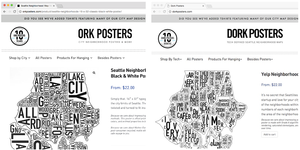 Figure 1: Comparison between the original Ork Posters (left) and the parodic Dork Posters (right) using Yelp data.
The "core" of the project was an algorithm that automatically populated neighborhood shapes with the top results from platform APIs. If Yelp’s "best match" for a gentrified area was a high-end bistro, that bistro's name became the neighborhood on the map.
Experimental Engagement: At the Designer's Meetup
The researchers took their posters to professional design workshops—the "natural habitat" of the people building these tools. The artifacts acted as a spectacle, drawing designers into conversations they usually avoid.
Key Insights:
- Tactics of Suppression: When faced with a map showing racial distribution (the "racial gradient" layer), some designers tried to dilute the findings, suggesting "more data" (like light rail proximity) was needed—a classic way to avoid discussing race directly.
- Ad Hoc Provenance: Seeing the reductionist data forced technologists to guess how the algorithms were actually working, exposing the "transparency paradox" where even the creators lose sight of the "why" behind the results.
- Reductionist Realization: One designer, upon seeing his favorite park represented, finally admitted: "Oh, it's reductionist!"—realizing that these platforms produce a limited, often commodified view of city life.
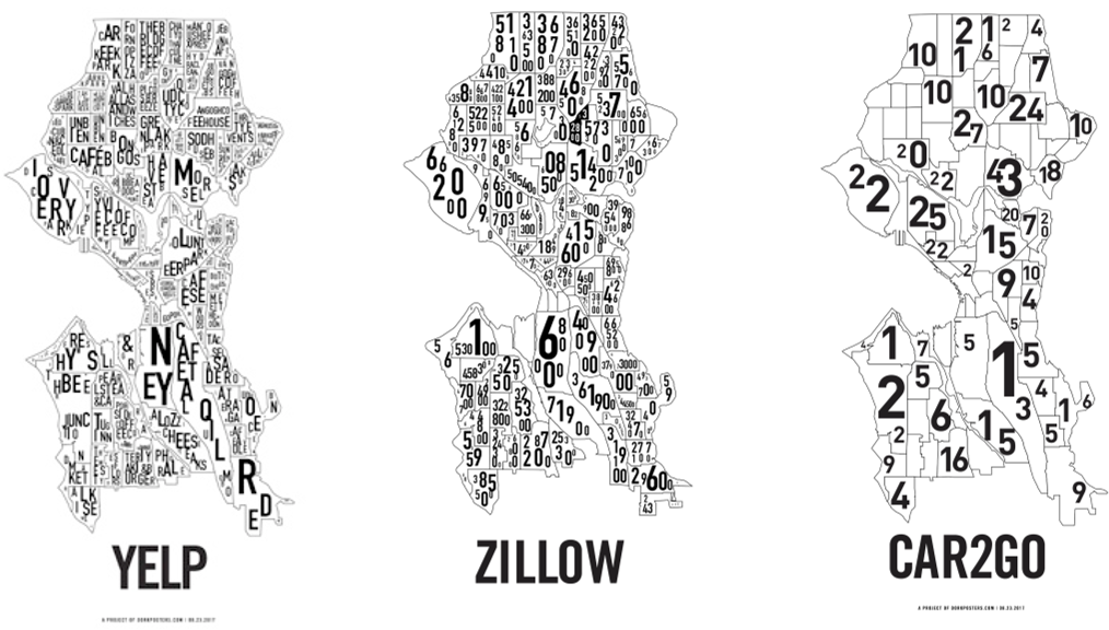 Figure 2: The three variants of Dork Posters: Yelp (Best Match), Zillow (Property Value), and Car2Go (Availability).
Critical Analysis: Why Parody Matters
The brilliance of this work lies in its Infrastructural Inversion. By making the "background" (the algorithm) the "foreground" (the map), it forces a confrontation with the politics of measurement.
Limitations & Future Work
The authors acknowledge that parody isn't a silver bullet. It creates a "temporary opening" for reflection but must be coupled with policy changes and public pressure. Furthermore, while the maps expose snapshots, they don't yet show how these biases evolve over time or "stabilize" neighborhoods into permanent "sketchy" or "elite" categories.
Conclusion: Beyond Aesthetics
"It matters what data make maps, and what maps make data." Parody in Place proves that HCI research shouldn't just be about making tools more efficient—it should be about making them more honest. Design parody allows us to "identity correct" powerful corporate entities, turning the mirror back on the systems that shape our geographic imagination.