
Past Working History Visualization: Why the "Process" is as Important as the "Result" in Data Mining
The Study of Past Working History Visualization for Supporting Trial and Error Approach in Data Mining
This paper introduces a visualization framework for "Past Working History" to support trial-and-error data mining. By mapping user interactions onto temporal, process-oriented, and spatial axes, the system enables researchers to navigate complex analysis paths in web browsing and genome science.
TL;DR
In the realm of data mining, the path to a discovery is often a messy, non-linear journey of trial and error. This paper proposes a visualization system that treats Past Working History as a first-class citizen. By mapping user interactions across Time, Process, and Spatial axes, the authors provide a "road map" of exploration, helping scientists in fields like Genome Science avoid redundant trials and better understand the relationship between their parameters and findings.
Problem & Motivation: The "Process Amnesia" in Data Mining
Modern data mining is rarely a "one-click" operation. Whether searching the web with ambiguous keywords or analyzing genomic copy numbers, researchers engage in a trial-and-error approach:
- Set parameters/queries.
- Observe visualized results.
- Interpret and decide on the next manipulation.
The Pain Point: In this iterative loop, users frequently forget the context of earlier trials. They might achieve a sub-optimal result without realizing a previous iteration was actually better, or they may waste time repeating specific trials because they lost track of their history. Traditional tools visualize the data, but they rarely visualize the search history itself in a way that supports cognition.
Methodology: The Three Axes of History
The authors suggest that working history should be automatically generated from interaction logs (OS logs, application parameters, web history) and visualized using three distinct dimensions:
- Time Axis: Mapping events chronologically (Z-axis in 3D or Y-axis in 2D) to show the flow of work.
- Process Axis: Capturing the logical hierarchy of the analysis. For instance, moving from a "whole view" to a "detailed zoom" creates a parent-child relationship in a dendrogram.
- Spatial Axis: Recording the physical state of the interface, such as the positions of slide-bars or the movement trajectory within a virtual environment.
Framework Architecture
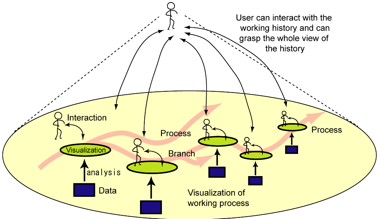 The figure above illustrates the concept: the analysis process is visualized like a branching road, allowing users to jump back to previous states and branch off into new trials.
Applications and Results
The authors validated their approach in two high-stakes domains:
1. Web Browsing History
Using a Firefox browser extension, they captured screenshots of every visited page and mapped them in 3D space. Pages from the same domain were clustered together, while the Z-axis represented time. This allowed users to visually "fly through" their browsing history, recognizing sites by their visual thumbnails rather than just text URLs.
2. Genome Science (Copy Number Analysis)
Genome researchers often toggle between a "Whole Chromosome View" and a "Detailed Band View." The proposed tool visualized this as a cyclic pattern, revealing how experts move back and forth between global context and local detail.
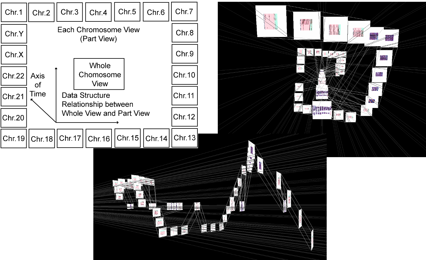 The system visualized the hierarchical selection (Whole -> Chromosome -> Band -> Comparison) as a dendrogram, providing a structural map of the expert's investigation.
Critical Analysis & Conclusion
The core value of this work lies in its recognition of Information Visualization as a Cognitive Multiplier. By externalizing working memory, the system reduces the mental load on the researcher.
Key Takeaways:
- Context is King: A result is meaningless without knowing the path taken to reach it.
- Visual Recognition > Textual Recall: Using thumbnails and spatial structures (roads/trees) is more effective for memory retrieval than simple text logs.
Limitations & Future Work: The authors acknowledge a significant bottleneck: Scale. As the history grows, the visualization can become as cluttered as the data itself. Future research must address "history pruning"—automatically identifying and highlighting only the most "pivotal" trials in the history road.
In an era of Big Data, this paper reminds us that we also need "Big History" tools to manage the complexity of our own analytical processes.