
Visualizing the Invisible: Decoding Social Networks in Space and Time
Pervasive and mobile computing
The paper presents a visual analytics framework for investigating spatiotemporal social networks using smartphone logs (GPS, WiFi, GSM, and call logs). By integrating four coordinated views—spatial, temporal, individual, and social matrix—the authors characterize human behavior and validate their approach through the Lausanne Data Collection Campaign.
TL;DR
This research moves beyond simple call-log analysis by embedding social networks within their geographical and temporal contexts. Using a custom-built visual analytics tool applied to the Nokia Mobile Data Challenge dataset, the authors demonstrate how interactive visualization can uncover hidden social behaviors—like car-pooling or cohabitation—and, more crucially, diagnose the systematic "holes" and errors often hidden in Big Data.
Academic Positioning: This work bridges the gap between automated "reality mining" and exploratory data analysis (EDA), arguing that interactive visualization is a necessary prerequisite for validating any automated inference model.
Problem & Motivation: The "Blind Spots" of Big Data
Most social network analyses are "space-blind." They assume that if two people don't call or text, they aren't connected. However, the authors argue that spatial proximity reduces the need for digital contact. If you live with someone, you call them less.
Furthermore, the "Big Data" captured by smartphones is often assumed to be complete because it is automatically logged. The authors challenge this "myth of completeness," highlighting how battery drains, lost signals, and user behavior (turning off devices) create significant gaps that can lead to false conclusions if fed blindly into a machine learning model.
Methodology: The Four-Pillar Visual Context
The authors rejected off-the-shelf software in favor of a prototyping approach using Processing (Java). Their tool creates a "linked-view" environment:
- Zoomable Map: Plots GPS, WiFi, and GSM-triangulated positions.
- Multiscale Timeline: Rows per participant, viewable linearly or aggregated by "hour of day" to see routine patterns.
- Individual Attributes: Visual encoding of age, gender, and social activity.
- Reorderable Social Matrix: Displays contacts, mutual friends, and Bluetooth proximity.
 Figure 1: The coordinated UI featuring (A) Map, (B) Timeline, and (C) Social Matrix views.
The "Mutual Contact" Insight
A brilliant technical move in this paper is the analysis of mutual contacts. Because the study only tracked 38 people, their direct network was sparse. By looking at "one degree of separation"—people outside the study that multiple participants called—the authors proved that the participants were actually part of a larger, well-connected community, likely couples or colleagues.
Experiments & Results: Serendipity in Debugging
The visual approach yielded findings that purely quantitative methods might have missed:
- The Timezone Glitch: By brushing two participants' timelines, they noticed a recurring 1-hour lag in their travel patterns. This wasn't a social behavior—it was a meta-data error where one participant's phone was set to a different timezone.
- Asymmetric Reality: Call logs showed calls made by Person A that did not appear in Person B’s receiver logs, exposing inconsistencies in smartphone "background" logging.
- Routine Detection: By analyzing the "temporal signature" of locations, the researchers could distinguish between residential hubs, workplaces, and transit zones (e.g., train stations).
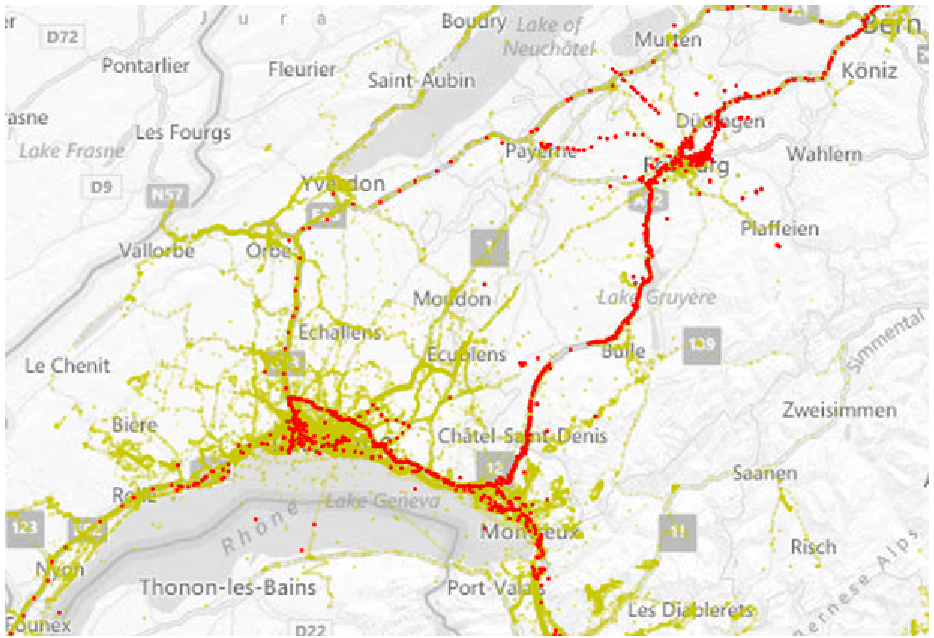 Figure 2: Using "Density Mode" to identify transit versus destination hotspots.
Critical Analysis & Conclusion
Takeaway
The core contribution of this work is the validation of human-in-the-loop analysis. For "Human-Centric Big Data," visualization serves as a crucial data-cleaning and hypothesis-generating layer.
Limitations
- Scalability: The "one row per participant" timeline design works for 38 people but would become unreadable for 3,800.
- Hardware Bias: The reliance on GSM/WiFi/GPS means "indoors" behavior is drastically underrepresented compared to "outdoors" or "near window" behavior.
Future Outlook
This paper serves as a blueprint for modern "Digital Twin" or "Smart City" analytics. As we move toward more autonomous systems, the "visual interrogation" of data quality described here will be vital to ensure our models are not just learning "noise" or "gaps" in the sensors.