
Designing for Reflection: Visualizing the Emotional Pulse of Urban Traffic
Creating reflections in public emotion visualization: prototype exploration on traffic theme
The paper presents a visualization prototype that maps public emotion regarding urban traffic using real-time data from Sina Weibo. It introduces a multi-layered interaction framework—City Sentiment, Related Topics, and Post Content—to transition viewers from macro-social trends to micro-individual perspectives.
TL;DR
This research moves beyond static charts to create a "living" visualization of how people feel about traffic. By processing massive streams of Sina Weibo data, the authors built a prototype that guides users through a three-stage journey: from national city rankings down to specific, filtered personal grievances.
The Core Challenge: Data vs. Insight
In the world of Information Visualization (InfoVis), we often prioritize "decision making"—how do I get from point A to point B faster? However, this paper argues for "sense making." The problem with social data is that it is either too abstract (a single "sentiment score" for a city) or too overwhelming (millions of individual tweets). There is rarely a bridge between the two that allows a citizen to reflect on their place within the social collective.
Methodology: The Three-Layered Mind Flow
The authors propose a "Reflective Mind Flow" to solve this, structured into three distinct interaction levels:
1. City Sentiment (The Macro View)
Users start with a high-level overview of 38 major Chinese cities. Using a color-coded system (warm for positive, cool for negative), viewers can instantly spot which cities are frustrated with their transit systems.
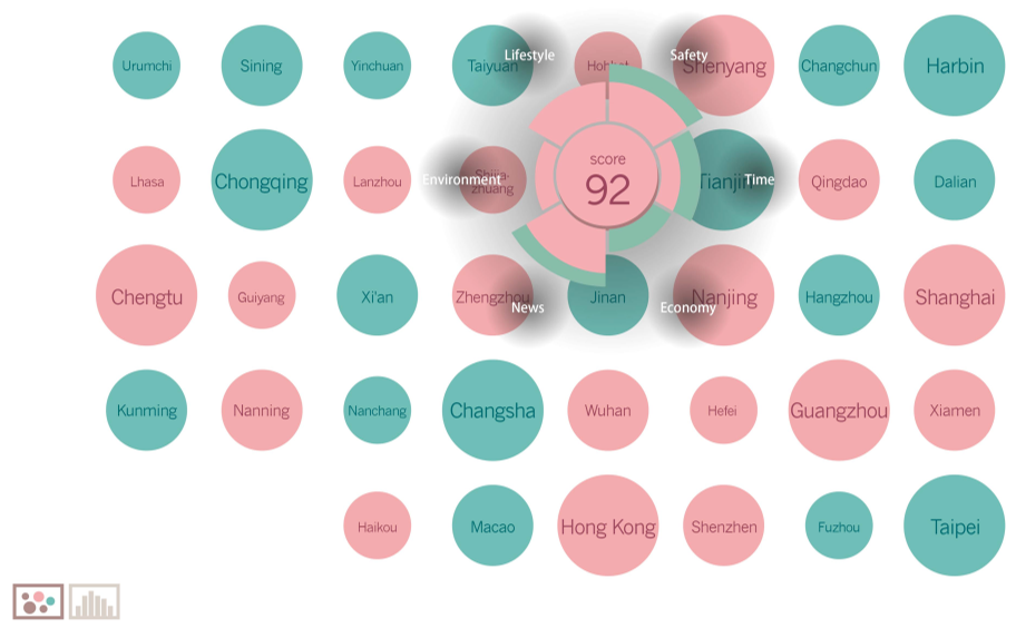 Figure 1 & 2: Score View (left) shows geographic sentiment clusters, while Comparison View (right) enables horizontal benchmarking.
2. Related Topics (The Analytic View)
Once a city is selected, the data is partitioned into six social themes: Safety, Lifestyle, Environment, News, Economy, and Time. This level introduces demographic metadata, showing who is complaining—is it the "Power Users" with thousands of followers, or the average commuter?
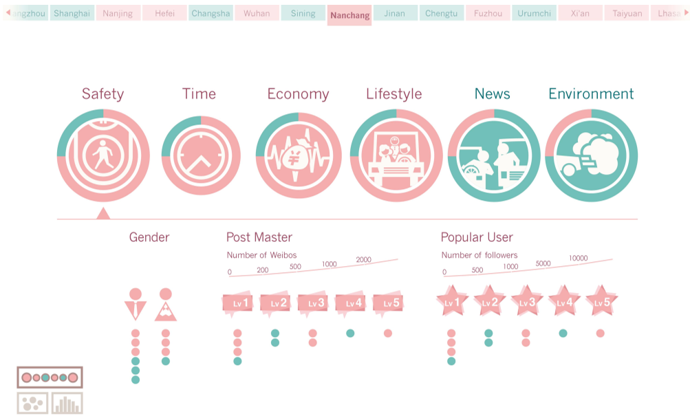 Figure 3: Breaking down sentiment into specific social sectors like Safety and Economy.
3. Post Content (The Micro View)
The final stage provides the raw data. By using a Dynamic Grid Layout, users can read actual posts. Critically, "self-involvement" is encouraged via filters, allowing users to find voices similar to their own (e.g., filtering by gender or posting frequency).
Technical Pipeline: Taming the Microblog Stream
The backend architecture handles the heavy lifting of Chinese Natural Language Processing (NLP):
- Filtering: Dynamically removing noise (e.g., distinguishing "traffic" from "Bank of Communications").
- THULAC: Utilizing Tsinghua University's lexical analyzer for word segmentation.
- Enhanced Dictionary: The authors modified standard sentiment dictionaries to account for domain-specific context (e.g., the word "lovely" is positive in general, but often sarcastic or neutral in traffic contexts).
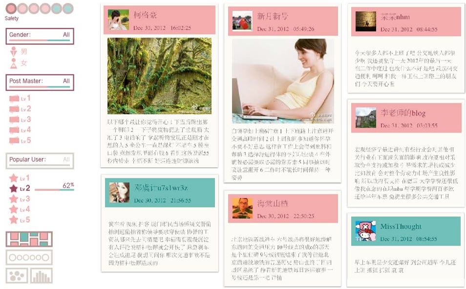 Figure 4: The final granular view where individual voices are humanized through high-fidelity filters.
Critical Insight: The Value of "Self-Involvement"
The most striking takeaway from this work is that data visualization is a social intervention. By providing filters for "Post Master" levels and "Popularity," the system doesn't just show data; it shows the hierarchy of influence within public discourse. The researchers found that users were more likely to form or correct their own opinions when they could "see themselves" in the data filter.
Conclusion
While this 2013 work predates the modern LLM era, its fundamental design philosophy remains highly relevant: effective visualization must balance the Overall Inclination (the forest) with Personal Attitudes (the trees). As we move toward more AI-driven social listening tools, the "Reflective Mind Flow" framework provides a blueprint for making big data feel personal and actionable.