
Designing for Intelligibility: The Social Media Dashboard as a "Boundary Object"
Making Social Media Activity Analytics Intelligible for Oneself and for Others: A “Boundary Object” Approach to Dashboard Design
This paper introduces a multidisciplinary approach to designing social media analytics dashboards by conceptualizing the dashboard as a "Boundary Object." It details the development of a prototype that bridges technical data processing with user intelligibility for community animators and members in professional contexts.
TL;DR
In the professional world, social media data is abundant but rarely intelligible to those who need it most. This paper proposes a shift in dashboard design—viewing the dashboard not just as a UI, but as a Boundary Object. By balancing the rigid requirements of data scientists with the practical needs of community managers, the authors created a prototype that facilitates multidisciplinary collaboration and empowers users to understand their digital footprint.
Background & Motivation: The "Intelligibility Gap"
As enterprises migrate to social networking platforms, we are drowning in data but starving for insight. Current analytics usually fall into two extremes:
- Simplistic Descriptive Stats: "Likes" and "Shares" that fail to capture the nuance of professional collaboration.
- Black-Box Algorithms: Complex clustering or NLP models that are mathematically sound but "unintelligible to the average mortal."
The author argues that for analytics to be valuable, they must be "intelligible for oneself (members) and for others (animators)." The challenge is: how do you build a tool that satisfies a mathematician's need for data validity and a community manager's need for actionable insights?
Methodology: The Boundary Object Framework
The core innovation lies in applying Boundary Object theory. A boundary object is something that inhabits several social worlds simultaneously. It is:
- Plastic: Flexible enough to adapt to local needs.
- Robust: Strong enough to maintain a common identity across different groups.
The Ecosystem
The project involves a "collision" of heterogeneous actors:
- Computer Scientists: Focusing on recommendation and clustering algorithms.
- Linguists (NLP): Analyzing the context and sentiment of textual corpora.
- HCI Scholars: Ensuring media literacy and usability.
- Industrial Partners: Seeking economic value and practical tools.
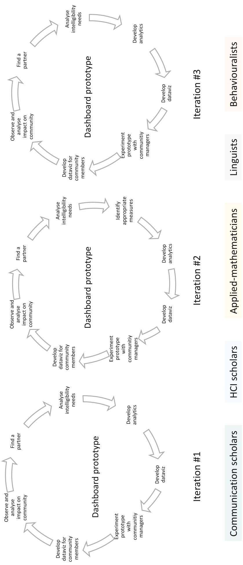 Note: The iterative protocol ensures the dashboard evolves through constant loops of design, testing, and feedback, preventing any single discipline from hijacking the project's meaning.
The "Tacking" Movement
The paper highlights a critical risk: the shift from a Boundary Object to an Intermediate Object.
- An Intermediate Object merely reflects the intention of the innovator (the "boss" of the project), often leading to a "sequenced" workflow where disciplines work in silos.
- To prevent this, the team practiced "Tacking"—constantly moving between the general purpose of the dashboard and the specific requirements of each discipline.
Experiments & Future Work
The prototype was developed in three analytical layers:
- Basic Level: Descriptive metrics.
- Meta Level: Social graphs identifying "Communities of Interest."
- Micro Level: Typical user profiling.
Early reception from industrial partners suggests that providing a prototype—even an incomplete one—acts as a "magnet" for data. By showing value early, the researchers gained access to the high-quality, sensitive data needed to refine the more complex algorithms.
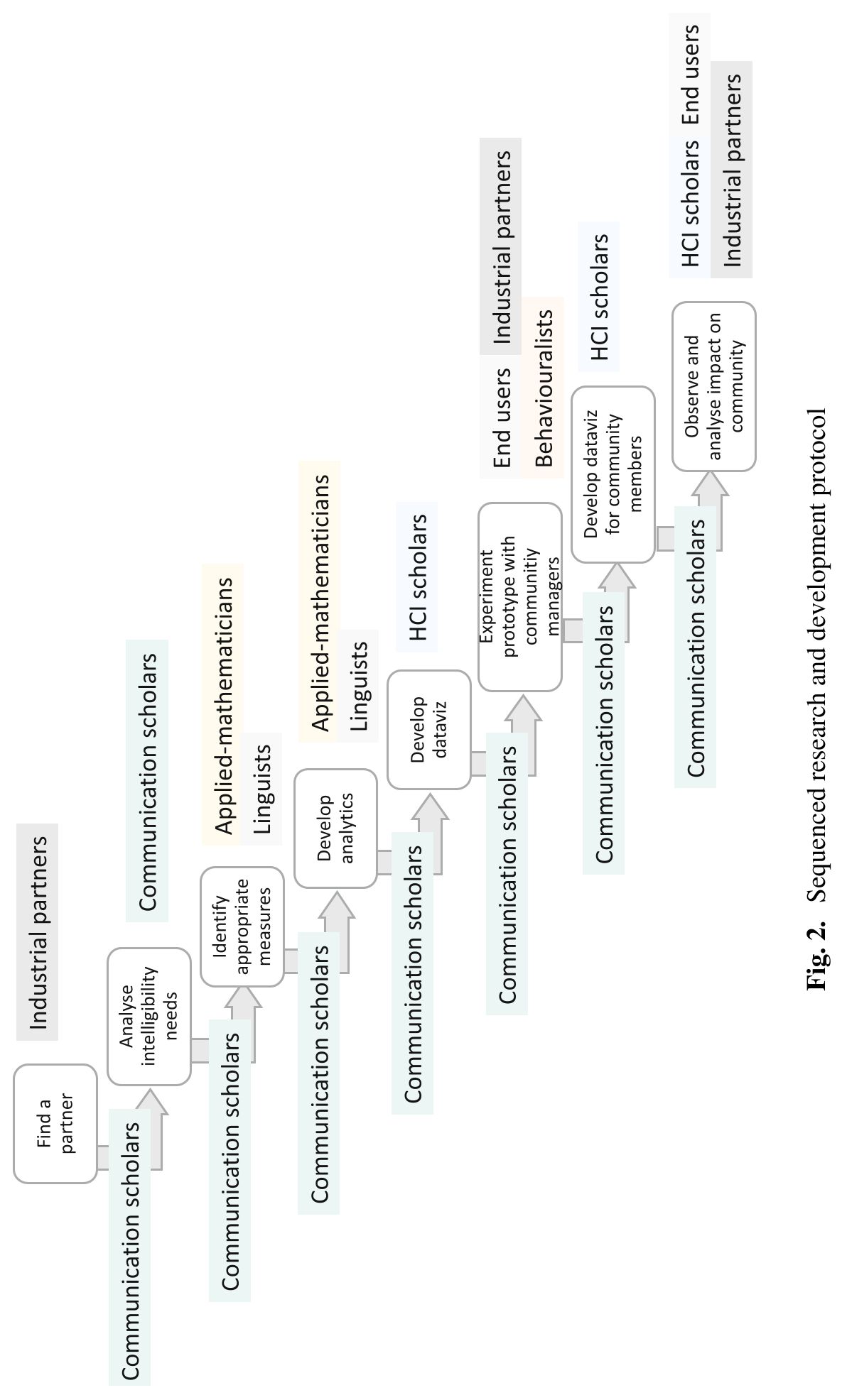 Note: The iterative loops bridge "Technology Push" (from research) and "Demand Pull" (from the market).
Critical Insight: Why This Matters
The true value of this paper is not the specific metrics on the dashboard, but the design philosophy. Most tech projects fail not because the code is bad, but because they lack a "means of translation" between stakeholders. Treating a dashboard as a boundary object acknowledges that a mathematician and a community manager will never see the data the same way—and that is okay. The tool's job is to let them cooperate without forced consensus.
Conclusion
The dashboard is more than a display of numbers; it is a "repository" of shared knowledge. As social media becomes the primary communication tool for professional teams, making that activity intelligible is a prerequisite for effective governance and empowered digital citizenship.