
The Fragmentation Paradox: Why All-in-One Social Media Dashboards Often Fail the User
Social Media Interactions and the Use of Third-Party Management Applications on Effectiveness and Perception of Information
This paper presents a qualitative usability study of 'Yoono', a third-party social media dashboard application designed to integrate multiple Social Networking Sites (SNS) like Facebook and Twitter into a single GUI. Using heuristics and eye-tracking, the study evaluates whether such aggregators improve interaction efficiency compared to traditional browser-based engagement.
TL;DR
Integrating multiple social networks into one screen sounds like a productivity dream, but poor usability often turns it into a nightmare. This study analyzes Yoono, a third-party dashboard, revealing that despite its goal to reduce "tab-fatigue," critical design flaws—such as non-intuitive iconography and poor feedback—resulted in a 50% task failure rate among experienced users.
Academic Positioning: This work serves as a cautionary usability audit within the Human-Computer Interaction (HCI) field, specifically targeting "Mash-up" and Dashboard applications in the Web 2.0 era.
Problem & Motivation: The Clutter of the Social Web
As social media platforms multiplied, users faced a fragmented experience. Switching between Facebook and Twitter (now X) across various browser tabs created a fragmented information flow.
The authors identify a clear Research Intuition: If a single graphical user interface (GUI) could aggregate these feeds into parallel columns, users would theoretically process information faster. However, the study posits that if the third-party app’s Inductive Bias (the way it expects users to behave) clashes with the native platform's logic, the application becomes an obstacle rather than an enabler.
Methodology: Testing the "One Screen" Promise
To test this, the researchers used a multi-method qualitative approach. They didn't just ask users if they liked the app; they watched where their eyes moved and measured exactly where they got stuck.
Core Tasks Included:
- Synchronizing and posting a photo to both platforms simultaneously.
- Managing "Column Views" to customize the feed.
- The deceptively simple task of logging out.
 Figure 1: The Yoono interface attempting to blend traditional browsing with localized SNS status updates.
Key Insights: Where the UX Broke Down
The study applied Nielsen’s Heuristics to diagnose the "50% failure rate." Several critical friction points emerged:
1. The "Finish" Button Trap (Consistency & Standards)
One of the most striking findings involved the login process. After entering credentials, a button labeled "Finish" appeared. Eye-tracking showed users staring at it but refusing to click. Why? In many software contexts, "Finish" implies "End Process" or "Exit." Users feared it would close the app rather than allow them to enter the dashboard.
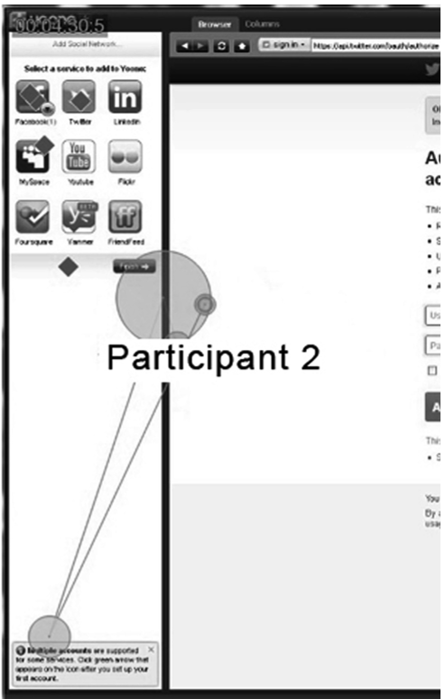 Figure 2: Eye-tracking heatmap showing participants fixated on the 'Finish' button, paralyzed by ambiguous labeling.
2. Visibility of System Status
A core tenet of UI design is that the system should always keep users informed about what is going on. Yoono failed here: when users posted updates, there was often no confirmation or "Sent" indicator. This led users to navigate back to a browser to check if their post actually existed, completely defeating the purpose of the dashboard.
3. The Logout Maze
The researchers found that participants could not find the "Log out" option without assistance. It was hidden under a "Wrench" icon—typically reserved for settings—and buried under a sub-menu for "adding accounts." This violation of Recognition rather than Recall created a significant security anxiety for users.
Experiments & Results: Efficiency vs. Intuition
The results were sobering. Even though the participants were "experienced SNS users," the average time to complete basic tasks was nearly 20 minutes.
- Success Rate: Only 50% of tasks were completed successfully in the given order.
- Aesthetic Load: The app used a grayscale, fixed-width column layout that created "dead white space" and failed to use color-coding (like Facebook Blue or Twitter Cyan) to help users cognitively sort information.
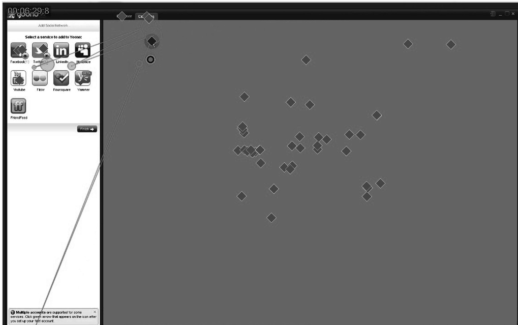 Figure 3: Click-stream data showing users searching for input fields in the wrong locations due to poor visual hierarchy.
Critical Analysis & Conclusion
The takeaway for developers of modern SaaS dashboards is clear: Centralization is not a feature if it breaks existing mental models.
Limitations & Future Work
The study was limited by a small sample size (n=8), though qualitative usability tests often find 80% of problems with just 5 users. However, the study's focus on a desktop app from the mid-2010s reflects an era before mobile OS-level integrations handled much of this "mash-up" logic.
Final Insight: Interaction design must prioritize the "Least Astonishment" principle. When an app tries to manage multiple complex services, it must adopt the Consistency Standards of its most dominant service to reduce the user's cognitive load. Yoono's failure wasn't in its technical ability to aggregate data, but in its inability to present that data in a way that felt "natural" to social media natives.