
Beyond the Hairball: Enhancing Process Mining with Chord Diagrams
Supporting Social Network Analysis Using Chord Diagram in Process Mining
This paper introduces the application of Chord Diagrams to Social Network Analysis (SNA) within the field of Process Mining. By implementing a ProM plug-in, the author provides a novel visual abstraction that handles dense interaction networks, achieving higher clarity in representing resource involvement and association directions compared to traditional node-link graphs.
TL;DR
Process mining often struggles with "visual overload" when analyzing how people interact within a business process. This paper introduces Chord Diagrams to the BPM toolkit. By mapping resources to circular arcs and interactions to colorful "chords," it transforms unreadable network "hairballs" into clear, interactive insights regarding resource involvement and work-handover patterns.
Background: The Scalability Wall in SNA
Social Network Analysis (SNA) in process mining aims to uncover how work flows between people. Traditionally, we use node-link diagrams. While intuitive for 5-10 nodes, real-life event logs (like the BPI Challenge datasets) involve dozens or hundreds of resources.
The result? A dense network graph where edges overlap so much that it's impossible to tell who is actually doing the bulk of the work or where the bottlenecks lie. The author identifies this lack of abstraction as a primary hurdle for business analysts.
Methodology: The Geometry of Interaction
The paper's core contribution is the formalization of the Chord Diagram for BPM. Instead of nodes floating in space, everyone is placed on a circle's circumference.
1. Mathematical Mapping
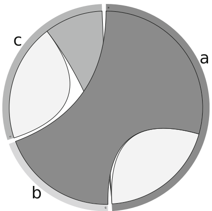
The length of an arc (a segment of the circle) is directly proportional to a resource's total interaction weight. If User A performs 50% of the handovers, their arc occupies 50% of the circle.
2. The Anatomy of a Chord
A chord connects two arcs. Crucially, the chord's thickness at its ends can differ. If User A sends work to User B often, but User B rarely sends it back, the chord will be thick at A's side and thin at B's. This captures the asymmetry of social interactions.
3. Qualitative Enhancements
To make these diagrams useful, the author implemented:
- Interactivity: Hovering over a resource highlights only its connections, filtering out the noise.
- Directional Coloring: The chord takes the color of the "dominant" resource (the one with the higher outgoing weight), making lead roles visually obvious.
Comparative Results: Real-World Evidence
Using the BPI Challenge 2015 logs (Dutch municipality building permits), the paper compares the old way vs. the new way.
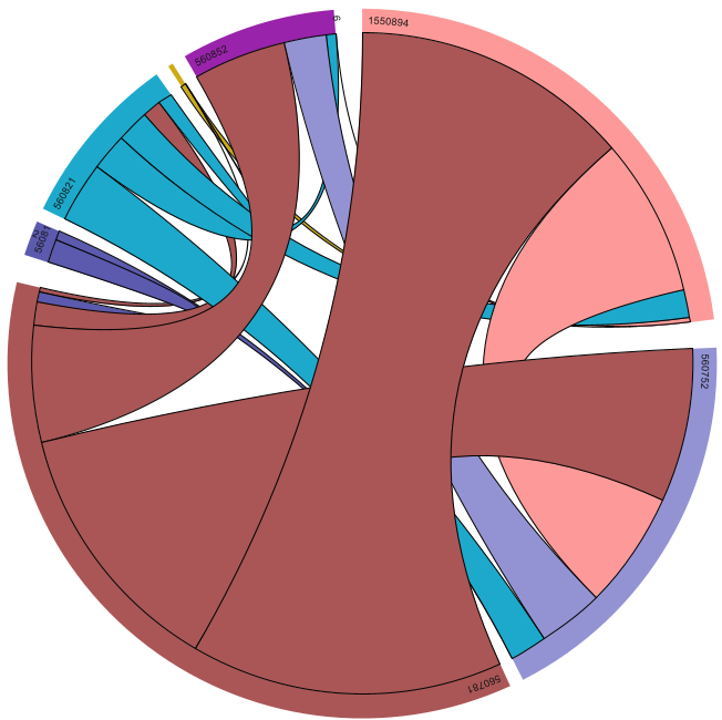
- Working Together (Case 1): Traditional graphs showed a mess of lines. The Chord Diagram immediately highlighted Resource "1898401" as a central hub (highest involvement) and showed that their relationships were primarily one-way (association direction).
- Subcontracting (Case 3): Interestingly, the study found a limitation—Chord Diagrams naturally omit "isolated" nodes (resources with no connections). While this cleans up the view, it means traditional graphs are still needed to find inactive participants.
Critical Insight & Conclusion
The power of this approach lies in Information Density. Unlike a node-link diagram that wastes empty "white space" in the center, the Chord Diagram utilizes the center of the circle to represent the volume of data.
Takeaways for the Industry:
- Slicing and Dicing: Chord diagrams should be the "first stop" for analysts to identify key players before diving into detailed process maps.
- Tooling: The implementation as a ProM/D3.js export suggests that modern BPM tools need to move beyond static images to web-based, interactive SVG visualizations.
Limitations: The method is less effective for identifying "lonely" resources or visualizing the specific sequence of activities, as it focuses purely on the strength of relationships rather than the temporal flow.