
Beyond the Graph: Ring-Based Visualization of Large-Scale Social Dynamics
Summarization and Visualization of Communication Patterns in a Large-Scale Social Network
This paper introduces a novel ring-based visualization and summarization framework for analyzing large-scale social network communication patterns (specifically email). By moving away from traditional graph layouts and using radial time-mapping, the authors detect and visualize "Periodic," "Isolated," and "Widespread" activity patterns across multiple time scales, validated on the 500k-message Enron dataset.
TL;DR
Most social network visualizations fail because they focus on structure (who knows whom) while ignoring rhythm (how they talk over time). This paper presents a "Ring" visualization framework that abandons standard graph layouts for a radial, ripple-inspired design. It allows users to spot communication peaks, periodic "regulars," and sudden "spikes" in email activity (like the Enron corpus) within a single, intuitive summary snapshot.
The Problem: The "Static Snapshot" Trap
Traditional graph visualization techniques excel at showing us a frozen moment in time. However, in a corporate environment where 150+ managers exchange half a million emails over years, static graphs become "hairballs." Even with time-sliders or animations, the human brain struggles to maintain a mental map of how communication patterns evolved from six months ago to today.
The authors argue that the missing link is temporal continuity. We don't just need to see the network; we need to see the flow of topics across people and time simultaneously.
Methodology: The Ripple Intuition
The core contribution of this work is the Ring Framework. Moving away from node-link diagrams, the authors adopt a radial bio-inspired metaphor:
- Time as Concentric Circles: Much like tree rings or ripples in a pond, time radiates outward. The innermost ring represents the most recent activity.
- People as Radial Constants: A specific person is assigned a consistent angular position (a colored dot). If they appear across multiple rings, they form a "line" from the center, making their long-term involvement instantly visible.
- Activity as Intensity: Darker circle colors represent higher message density for a specific time slot.
Identifying Social "DNA" Patterns
The system doesn't just display data; it detects three specific "Social Rhythms":
- Periodic Patterns: Using local maxima of message activity to find recurring topics (e.g., weekly status reports).
- Isolated Patterns (Spikes): Identifying "Information Generators"—the small percentage of people (top 15%) responsible for the majority of communication (65%+ message coverage) during a crisis.
- Regulars: Groups of people who appear together frequently, identified via set intersection algorithms.
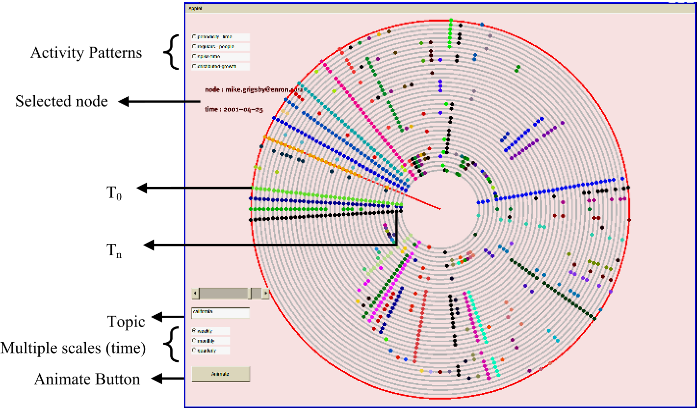
Experiments: Mining the Enron Corpus
The authors put their framework to the test using the infamous Enron email dataset. For a query like "California" (a major topic during Enron's energy crisis), the system could extract the most relevant actors and temporal spikes.
Key Results
The user study (on a 7-point scale) revealed that the system was particularly effective at:
- Summary Snapshots (6.25/7): Users loved the ability to see a "highlight reel" of patterns before diving into the raw data.
- Pattern Usefulness (6.25/7): High scores for the system's ability to help users understand the relationship between topics and time.
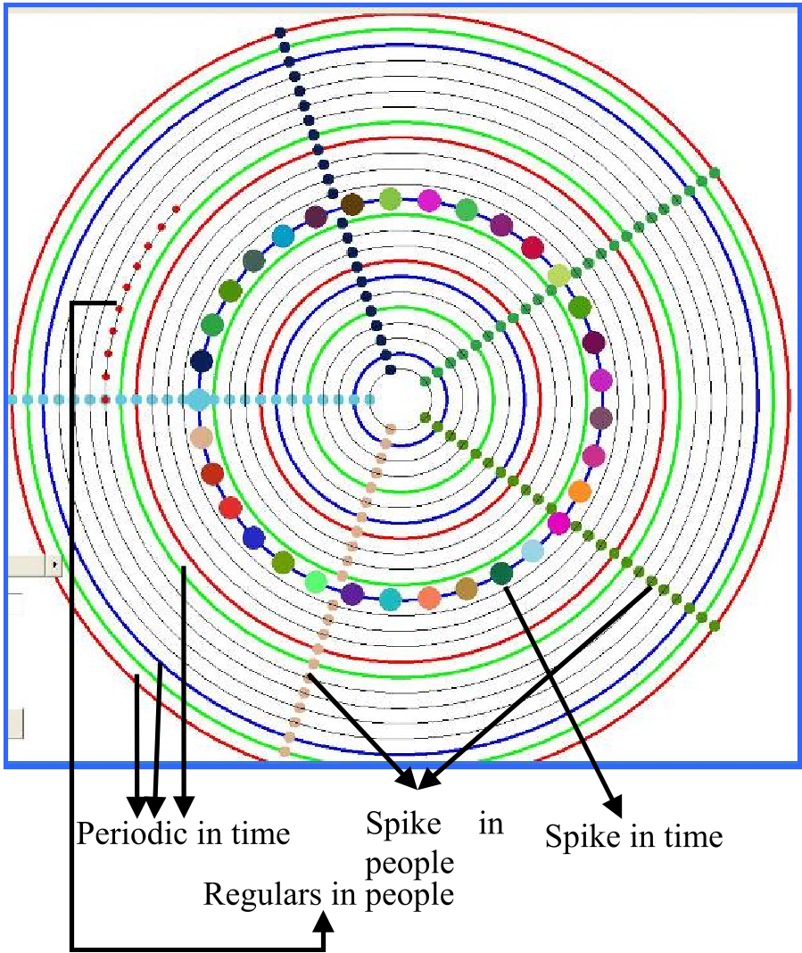
Critical Analysis & Conclusion
The true value of this research lies in its Inductive Bias—the assumption that temporal social data is better served by radial geometry than Euclidean graph layouts.
Takeaway
While traditional graphs show us the "skeleton" of a network, the Ring Framework shows us its "pulse." It shifts the focus from connectivity to cadence.
Limitations & Future Work
One limitation is the ordering of people. Currently, people are ordered by their first appearance, which may not be the most meaningful metric for large networks where thousands of people interact. Future iterations suggested by users include:
- Multi-topic Comparison: Visualizing how two different scandals or projects overlap in the same ring space.
- Personal Centricity: Allowing a user to "center" the ring on a single person to see their unique environmental influence.
This paper serves as a foundational bridge between information retrieval and behavioral visualization, proving that sometimes, to see the big picture, we have to look at the patterns, not just the nodes.