
Visualizing Evolution: Mastering Social Network Dynamics with NodeXL and TempoVis
Temporal Visualization of Social Network Dynamics: Prototypes for Nation of Neighbors
This paper introduces two visualization prototypes, NodeXL and TempoVis, designed to analyze the temporal dynamics of the "Nation of Neighbors" social network. It proposes five core design principles for temporal network visualization, focusing on maintaining stable node positions while highlighting addition, removal, and aging through color intensity.
TL;DR
Analyzing how social communities grow and decay is notoriously difficult because networks are "living" entities. This paper addresses this by proposing five principles for temporal visualization and introducing two tools: NodeXL (an Excel-based analyzer) and TempoVis (an interactive time-slider prototype). By fixing the positions of existing members and using color intensity to represent the "age" of interactions, these tools allow community managers to spot trends without the confusion of traditional animations.
Background: Why "Network Movies" Often Fail
Societies are not snapshots; they are processes. However, most visualization tools treat them as static graphs. When researchers try to add a temporal dimension, they often resort to animations where nodes jump around as new data arrives. This creates a "distraction effect" where the human eye misses subtle but vital changes—like a single influential user joining a quiet group—because the entire layout is shifting.
The Core Principles of Temporal Visualization
The authors argue that for a visualization to be actionable, it must follow five "Golden Rules":
- Fix the Static: Unchanged parts of the graph should stay put.
- Manifest Change: New additions must be visually distinct (e.g., bright red).
- Interactive Exploration: Users should be able to "scrub" through time like a video.
- Attribute Discovery: Changes in node properties (like popularity) should be visible.
- Subgraph Focus: Users must be able to zoom into specific clusters to see their localized history.
Methodology: The Three States of a Node
To implement these principles, the researchers categorized every element into three states: Addition, Removal, and Aging.
While Addition and Removal are straightforward, Aging is handled through a clever "intensity" mechanism. Using a sigmoid function, the system gradually fades the color of an edge as time passes. This creates a visual "comet tail" effect: the most recent activities are vibrant, while historical data remains in the background as a faint gray skeleton, providing context without clutter.
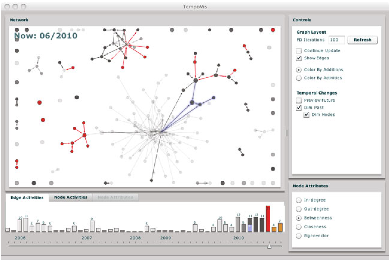 Fig 1: The TempoVis interface featuring the interactive time-slider and activity histogram.
Two Paths: NodeXL vs. TempoVis
The research presents two distinct architectural approaches:
- NodeXL: Built as an extension to Microsoft Excel, it targets users who are comfortable with spreadsheets. It maps graph statistics (like Betweenness Centrality) directly to visual attributes. While powerful for deep analysis, it lacks "fluid" temporal navigation.
- TempoVis: A standalone tool designed purely for exploration. It features a time-slider linked to a histogram. As you slide through months, the network "lights up" in red where new conversations are happening.
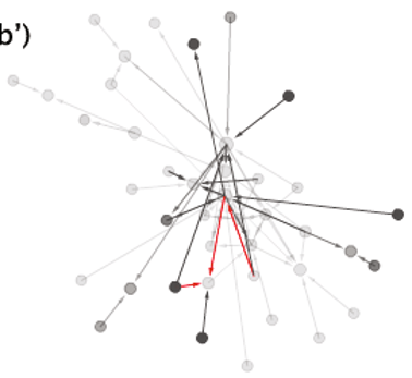 Fig 2: Comparison of successive time steps (a to b) and the aging effect (b') that visually preserves history.
Experimental Insights
Using data from Nation of Neighbors (a community safety network), the authors demonstrated that these tools could help moderators identify "bridge" users who connect disparate neighborhoods. By selecting a specific region of the graph with a marquee tool, managers could see an overlay on the histogram showing when that specific group was most active, linking structural position to temporal spikes.
Critical Analysis & Future Work
The "fixed-position" approach is a double-edged sword. While it prevents distraction, it can lead to massive clutter as a network grows significantly over years. The authors acknowledge this and suggest that future versions should allow for "periodic redrawing" to optimize the layout once a certain threshold of change is reached.
Conclusion
This work moves us away from "snapshots" and toward a "cinematic" understanding of social data. By prioritizing visual stability and using color as a dimension of time, NodeXL and TempoVis provide a blueprint for tools that don't just show us who is in a network, but how the network is breathing.