
TweeProfiles3: Bridging the Gap Between Live Tweets and Actionable Journalism
TweeProfiles3: Visualization of Spatio-Temporal Patterns on Twitter
TweeProfiles3 is a real-time visualization system designed to extract and display spatio-temporal, content, and social patterns from Twitter streams. It integrates the SocialBus extraction platform with Stream Clustering algorithms (DenStream and DBSCAN) to provide an interactive dashboard for professional journalism.
TL;DR
TweeProfiles3 is a sophisticated visualization framework that transforms the chaotic firehose of Twitter data into structured, real-time insights. By combining Stream Clustering with an intuitive multi-widget dashboard, it allows journalists to track where, when, and what people are discussing as events unfold.
Perspective: The Need for Real-Time Synthesis
In the digital age, journalists are no longer just reporters; they are data synthesizers. The primary challenge isn't a lack of information—it's the sheer volume and velocity of it. Existing tools often decouple the where (geospatial) from the what (content) and the when (temporal). TweeProfiles3 serves as a "situational awareness" engine that glues these dimensions together using unsupervised learning.
Methodology: From Raw Streams to Micro-Clusters
The "magic" under the hood happens in a four-stage architecture: Data Handling, Clustering, Mapping, and Search.
The core technical innovation lies in its clustering pipeline. Instead of a static analysis, it uses:
- DenStream: For real-time micro-cluster generation.
- DBSCAN: To aggregate these into meaningful macro-clusters.
This dual approach ensures the system can handle the "noise" of Twitter while still identifying significant, dense patterns of activity.
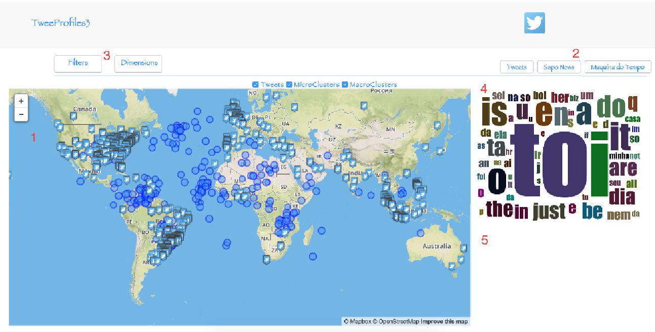 Figure 1: The TweeProfiles3 interface showing the integration of the geographical map, word cloud, and tweet list.
Visualizing Time and Space
The system doesn't just put dots on a map. It uses a Spatio-Temporal Representation logic:
- Heatmaps: Provide a density overview of tweets.
- Circular Markers: Represent clusters, where the size and color indicate the duration and significance of the discussion.
- Horizontal Timelines: Allow users to see the "life-span" of a topic, identifying when a cluster started and ended.
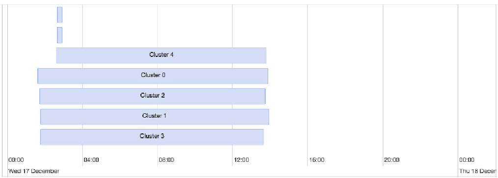 Figure 2: The temporal timeline widget used to track the evolution of clusters over a 7-day period.
Evaluation: The Journalist's Verdict
To validate the tool, the authors conducted usability tests with journalists. The results were telling:
- Layout & Simplicity: Rated exceptionally high (5/5 for layout). Journalists appreciated that clicking a cluster on the map automatically updated the news feed and word cloud.
- Real-World Utility: Participants noted that during major events (like the Charlie Hebdo attack), the tool provided a unique "pulse" of public sentiment that traditional news wires lacked.
- The Sapo Connection: By linking tweets to actual news articles via the SAPO Labs API, the tool provides context that plain social media scrapers miss.
Critical Insight & Limitations
While TweeProfiles3 is a significant step forward, it reveals a common "Inductive Bias" in current social media tools: the reliance on text. Journalists mentioned that the exclusion of hashtags and images is a major blind spot, as modern trends are often visual or hashtag-driven. Furthermore, as the authors admit, the overlapping of markers in high-density areas (clutter) remains an information visualization challenge.
Conclusion
TweeProfiles3 moves social media analysis from "post-mortem" reporting to "live" discovery. For researchers, it highlights the importance of multi-dimensional correlation. For the industry, it provides a blueprint for the next generation of newsroom tools.
Future Outlook: The next frontier for TweeProfiles3 will likely involve incorporating multi-modal data (images) and sentiment analysis to provide a deeper emotional layer to the spatio-temporal clusters.