
Instagram for the Silver Generation: Does Slowness Equal Failure?
Usability assessment of the instagram application on smartphones with emphasis on elderly users
This study presents a usability assessment of the Instagram mobile application, specifically comparing elderly users (60+) against young and middle-aged adults. Using a multi-methodological approach including task performance metrics and Likert-scale satisfaction surveys, the research identifies significant gaps in execution speed while highlighting surprisingly high levels of user satisfaction and adoption interest among seniors.
TL;DR
As the global population ages, the "Silver Economy" is becoming a critical focus for tech companies. This research evaluates how users over 60 interact with Instagram compared to younger cohorts. While seniors are significantly slower—often taking five times longer to complete a simple post—their levels of satisfaction and willingness to reuse the app remain exceptionally high, challenging the assumption that high friction leads to user abandonment.
The Motivation: A Growing Demographic Gap
While mobile penetration reached one device per inhabitant in countries like Brazil, the software driving these devices often assumes a level of "digital intuition" that older adults simply lack. The authors identified a critical tension: the elderly population is projected to nearly double within decades, yet social networks like Instagram rely on abstract visual metaphors that can alienate this demographic.
The core research question: How does age impact the efficiency, error rate, and emotional satisfaction of using a visually intensive platform like Instagram?
Methodology: Putting the Pixels to the Test
The study utilized a cohort of 60 volunteers, categorized into:
- Younger Adults (18-39)
- Middle-aged Adults (40-59)
- Elderly (60-91)
Each participant used the same smartphone model and a 3G connection to eliminate hardware bias. They performed three core tasks (T1: Follow, T2: Post, T3: Share) while researchers measured the following metrics:
- Learning Time: Speed of recognizing the application’s logic.
- Performance: Raw execution time.
- Error Rates: Frequency of misclicks or navigation dead-ends.
- Retention: Ability to replicate the task later.
- Subjectivity: Likert-scale satisfaction.

The "Efficiency vs. Satisfaction" Paradox
The results revealed a fascinating disconnect between quantitative speed and qualitative experience.
1. The Performance Gap
Across all tasks, the time difference was stark. Elderly participants averaged 98.17 seconds, whereas young adults cruised through in 22.27 seconds.
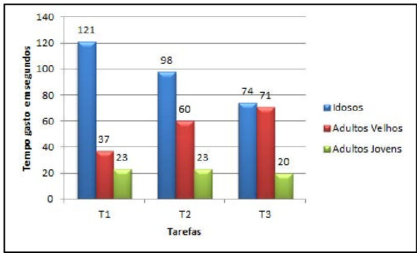 Figure 1: Notice the massive spike in time for the Elderly group during Task 1 (Following a contact), which normalized slightly by Task 3.
2. The Iconography Barrier
One of the most profound insights was the failure of the "Paper Airplane" icon. While younger users instinctively associated it with "sending" or "direct messaging," elderly users found it abstract. They reported that a simple arrow or a text label would have been significantly more intuitive.
3. Resilience and Satisfaction
Surprisingly, despite the struggle, 95% of the elderly participants stated they would use Instagram again. This suggests that for this demographic, the "reward" of social connection far outweighs the "cost" of high interaction effort. Their satisfaction was even higher than the middle-aged group (40-59), who were more critical of the interface's attractiveness.
Critical Analysis: Why This Matters for the Industry
This paper highlights a critical "Inductive Bias" in modern UI design: we design for speed, assuming that high latency in task completion is a sign of a failing product. However, for elder users, slowness is part of the learning process, not necessarily a deterrent to use.
Limitations
- Sample Size: 60 participants is a solid start but may not capture the wide spectrum of cognitive health in seniors.
- Gender Imbalance: The elderly group was 90% female, which might influence the social satisfaction results.
Future Outlook
The study concludes that as the elderly become a major market niche, companies must move beyond "one-size-fits-all" interfaces. Future apps might include:
- Contextual Labels: Dynamically adding text to icons (e.g., "Send" next to the paper airplane) for users with slower interaction signatures.
- Error Correction: Simplified "Undo" buttons that reduce the fear of making mistakes—the primary psychological barrier for seniors.
The Bottom Line: Inclusion isn't just about making fonts bigger; it's about understanding that the meaning of "intuition" changes as we age.