
Beyond Boring Text: A Visual Radar for Privacy Awareness in Social Networks
A Visual Model for Privacy Awareness and Understanding in Online Social Networks
This paper introduces a novel visual model and an interactive privacy controller designed to enhance user awareness and understanding of privacy settings in Online Social Networks (OSNs). By representing sharing actions as 5D radar charts—covering "Who, What, When, Where, and Whom"—the authors provide a quantitative and intuitive method for users to manage information exposure, specifically evaluated on Facebook.
TL;DR
Privacy settings on platforms like Facebook are notoriously confusing. This paper introduces a 5D Radar Chart model that transforms abstract privacy policies into a tangible "shape" of information exposure. By making it physically harder to increase exposure and easier to decrease it, the system nudges users toward safer sharing habits.
The "Invisible" Leak: Why Better Logic Isn't Solving Privacy
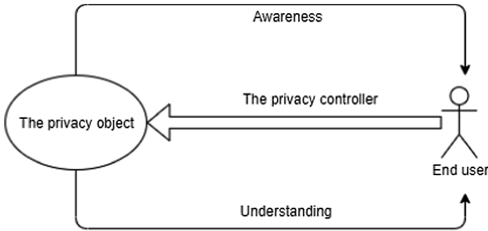
We have the technology to protect data—encryption and robust access control lists (ACLs) are everywhere. Yet, sensitive data leaks daily. The bottleneck isn't the backend; it's the User Interface (UI).
Current privacy settings suffer from two fatal flaws:
- Lack of Awareness: Users don't notice when a setting has changed or if a post is public.
- Lack of Understanding: Users can't calculate the cumulative risk of tagging a location, a person, and a specific time simultaneously.
The authors argue that we need a model that provides immediate, visual feedback on the "volume" of information being leaked.
Methodology: The 5-Dimension Privacy Object
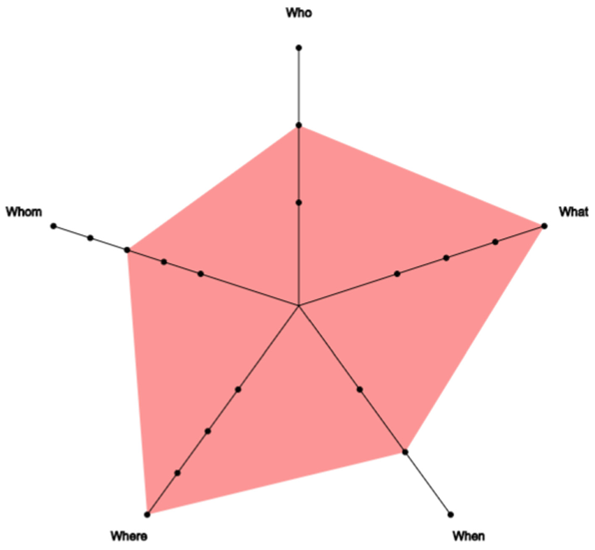
The core of this research is the Privacy Object, which quantifies a sharing action across five axes:
- Who: Who is affected (e.g., tagged friends)?
- What: How sensitive is the content (e.g., PII vs. a public link)?
- When: Timing accuracy (e.g., real-time sharing vs. delayed posting).
- Where: Location precision (e.g., exact GPS coords vs. city-level).
- Whom: The audience size (e.g., "Only Me" vs. "Public").
The Radar Chart Interface
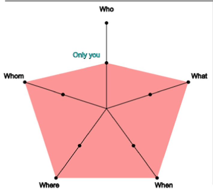
Instead of checkboxes, the user sees a radar chart. The larger the area of the chart, the higher the privacy risk.
Soft Paternalism in Action
The Privacy Controller implements an "Asymmetric Effort" mechanism.
- Moving toward the center (Safe): Intuitive and easy.
- Moving toward the edge (Risky): Requires the user to hold the
Shiftkey and receive a warning nudge.
Experiments: Proof of Concept
The authors tested the model on 15 students using a simulated Facebook environment.
Key Result 1: Awareness Boost
When comparing changes in the "When" (time) and "Where" (location) dimensions, the visual model outperformed the standard Facebook-style text interface significantly. Users were much faster at spotting when they were about to over-share.
Key Result 2: Cognitive Insight
80% of users agreed that the "area" of the radar chart gave them an immediate gut feeling about their privacy exposure that text could never provide. However, they noted that text labels are still necessary for "confidence" in specific settings.
Critical Analysis & Conclusion
Takeaway
This paper successfully bridges the gap between Information Visualization and Online Privacy. By converting 1D text settings into a 2D shape, it leverages the human brain's natural ability to recognize patterns and size, making "privacy volume" a tangible concept.
Limitations
- Metric Rigor: Defining exactly "how much more sensitive" a photo is compared to a text post remains subjective.
- Scalability: In a real app with 100+ notifications, would a radar chart become "visual noise"?
- Business Conflict: The authors rightly point out that OSN providers (who thrive on data sharing) may be reluctant to implement a tool that actively discourages users from sharing.
Future Work
The next frontier is a user-defined metric, where the radar chart shapes itself based on what you personally find sensitive—be it your location or the people you hang out with.
Note: This research highlights that the future of privacy isn't just better code, but better communication between the machine and the human.