
Beyond Global Change: Tracking Individual Journeys in Dynamic Social Networks
Visualizing dynamic trajectories in social networks
The paper introduces a novel visualization framework for tracking dynamic individual trajectories within social networks, moving beyond traditional global evolution views. It proposes two primary visual models—Concept Maps (based on Voronoi and Radial layouts) and Temporal Representations (History Diagrams)—to map actor movements over time.
TL;DR
Standard social network visualizations often show the "whole forest" of network growth but lose the "individual trees." This paper proposes a framework to visualize individual trajectories—the path an actor takes through different concepts or groups over time. By using map-based metaphors and temporal "history diagrams," the authors provide a way to see how a researcher’s interests shift or how a star athlete transforms a team’s performance.
The "Tracking" Problem in Social Science
In the study of social networks, change is constant. A researcher might start in Information Visualization and drift into Databases; a basketball player might move from the Lakers to the Heat.
While we have tools to show how the total density of a network changes (Global Evolution), tracking a single "node" as it wanders through a massive graph is cognitively exhausting. The authors argue that since humans can only track a few items at once, we need a locally dynamic but globally static background to provide context.
Methodology: The Landscape and the Path
The framework relies on two distinct visual metaphors to ground the dynamic data:
1. The Concept Map (Voronoi & Radial)
Instead of abstract dots and lines, the authors create a "Map" where regions represent topics or categories.
- Voronoi Map: Uses Multidimensional Scaling (MDS) to place similar topics (like "Query" and "Schema") near each other. Voronoi cells are then "smoothed" with random points to look like natural geographic borders.
- Radial Map: Useful for networks with a hierarchy (like NBA team rankings), where the most "central" or successful actors are placed in the middle of concentric circles.
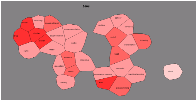 Figure 1 & 2: The Voronoi similarity-based map vs. the Radial hierarchical map.
2. Temporal Representations
To show time, the authors introduce the Temporal Map (where regions are split into concentric layers representing years) and the History Diagram (a parallel-coordinates style view).
3. Visualizing the Trajectories
The "movement" of individuals is rendered in three ways:
- Animation: 2.5D views where a node "flies" like an airplane from one map region to another.
- Color Representation: Shading specific time-layers in a region to show when an actor was "present" there.
- Line Representation: Drawing Bézier curves across the map to connect time steps, showing the physical path of evolution.
Case Study Insights: DBLP & NBA
The authors applied their framework to the DBLP Computer Science Bibliography and NBA statistics.
The "Lin" Trajectory
By mapping the publications of researcher Xuemin Lin, the system revealed a clear shift: Lin began with an interest in Information Visualization (the "northern" part of the map) before migrating permanently into the Database area ("southern" regions).
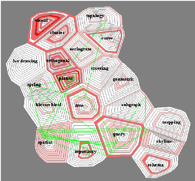 Figure 12: Visualizing a decade of research evolution using line segments.
The "Shaq" Effect
In the NBA study, the movement of Shaquille O'Neal in 2004 was analyzed. The History Diagram (Figure 17) showed that when O'Neal moved to the Miami Heat, the team's "strip" immediately thickened (indicating better performance) while the Lakers' strip narrowed.
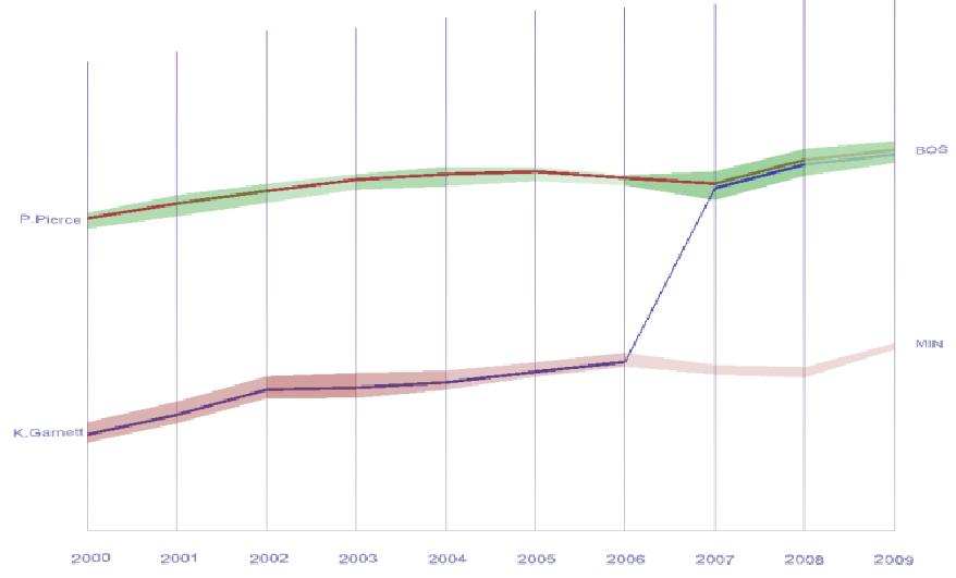 Figure 17: Individual trajectory (blue line) vs. Team performance (background strips).
Critical Analysis & Conclusion
Takeaways
- Spatial Context Matters: Map metaphors work because they leverage our existing long-term memory for geographic navigation.
- Suitability Split: Animation is great for tracking a few (2-5) people at once, while History Diagrams are superior for identifying long-term collaboration patterns (like supervisor-student relationships).
Limitations & Future Work
The biggest challenge remains scalability. While the map provides a static background, visualizing hundreds of trajectories simultaneously would result in "spaghetti" layouts. The authors plan to conduct more controlled human experiments to determine exactly how much information a user can absorb before the "Map" becomes too cluttered to read.
In conclusion, this work provides a vital bridge between static graph snapshots and chaotic animations, offering a "landscaped" approach to the history of social interaction.