
Visualizing the Social Pulse: How Our Interests Evolve on Facebook
Visualizing the Evolution of Users' Profiles from Online Social Networks
The paper proposes a novel framework for visualizing the evolution of user profiles in Online Social Networks (OSNs) using temporal and dynamic graphs. By applying text mining to user interactions and stream activities on Facebook, the approach identifies both long-term and short-term interests and maps their evolution over time.
TL;DR
This research moves beyond traditional "weight-based" user profiling by introducing a visual, graph-based approach to track user interests over time. By analyzing Facebook stream activities, the authors distinguish between enduring long-term passions and fleeting short-term interests, while revealing how our social circles act as catalysts for new hobbies and "phases."
Background: Static Profiles in a Dynamic World
In the landscape of Information Retrieval, understanding a user's "Java" search—whether they want a programming tutorial or a flight to Indonesia—requires a deep understanding of their current context and historical background. However, most existing systems treat user profiles as relatively static data points or hidden numerical vectors. This paper argues that to truly understand a user, we must visualize the evolution of their interests as a dynamic interplay between time and social connections.
The Core Challenge: Capturing the Temporal Flux
The difficulty in modeling OSN users lies in the sheer volume and "noise" of stream data. Prior works often failed because:
- They didn't account for the influence of social ties on interest formation.
- They lacked a method to intuitively separate Long-Term vs. Short-Term profiles without arbitrary thresholds.
- They relied on sparse HTML scraping rather than rich API-driven activity streams.
Methodology: From Text Mining to 3D Visualization
The authors developed a three-step pipeline—Extraction, Preparation, and Visualization—to turn raw Facebook data into actionable insights.
1. Data Extraction & Text Mining
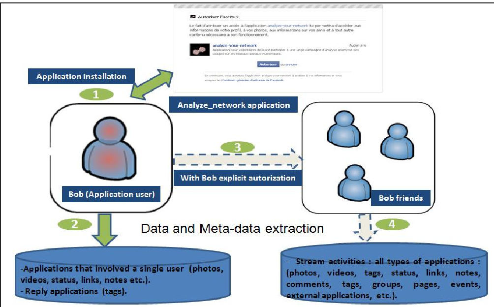
Using a custom Facebook app ("analyze_network"), the researchers gathered anonymized stream data from 85 volunteers and their 7,081 friends. They applied a specialized text-mining process:
- Positive Filters: Retaining high-frequency domain concepts.
- Negative Filters: Removing stop words and meaningless "empty" concepts.
- Synonym Dictionaries: Consolidating diverse terms into single interests.
2. The 3D Co-occurrence Matrix
Interests are normalized into a 3D matrix (User, Interest, Time). By dividing time into semesters, the system calculates the "weight" of a tie based on how often a user and an interest appear together in a specific window.
Insight: Long-Term vs. Short-Term Interests
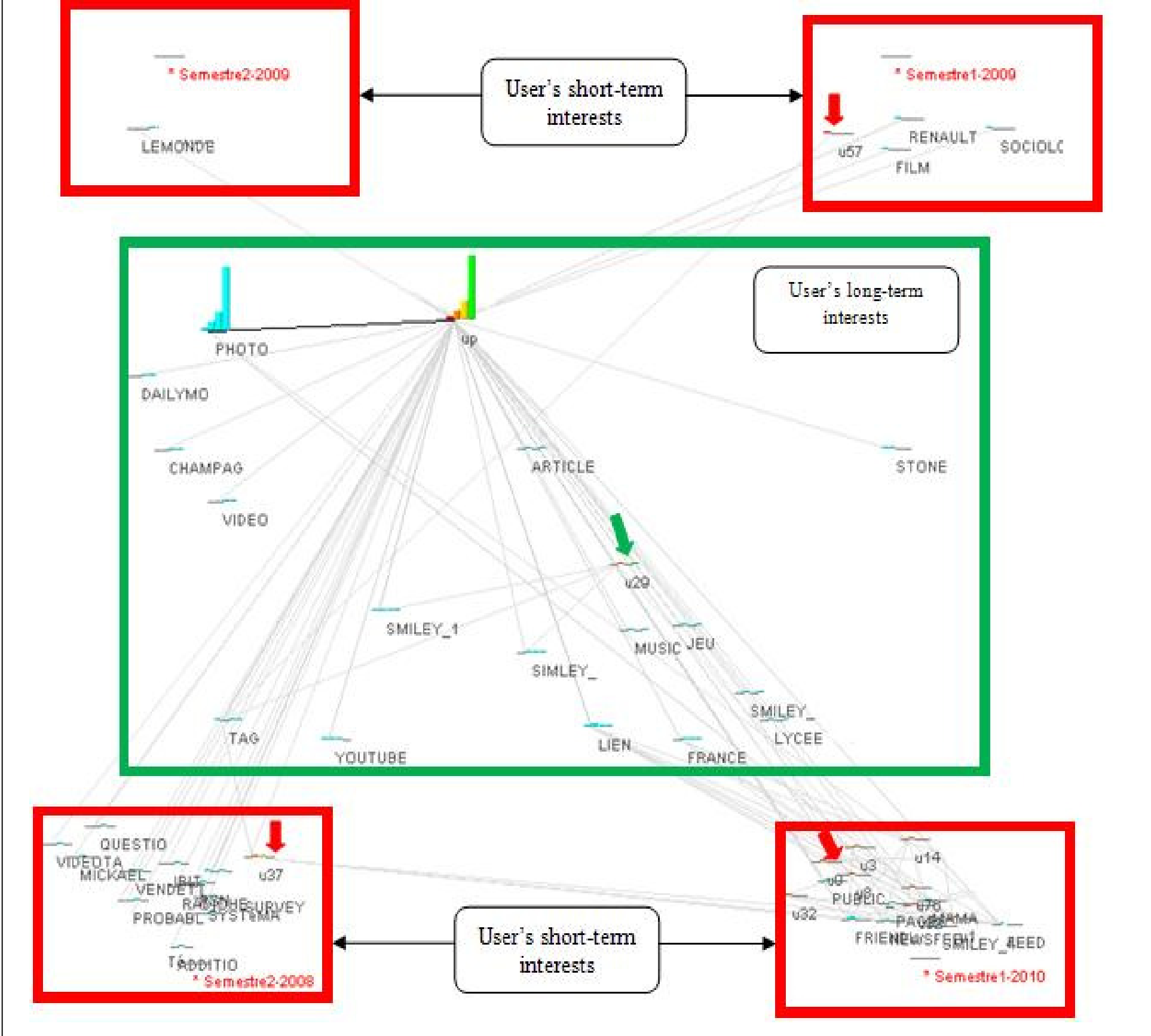
The study uses an egocentric network visualization to categorize interests:
- Long-Term Interests: Found near the center of the graph, these nodes (like "Music" or "Games") show consistent activity across all time periods (semesters).
- Short-Term Interests: Nodes that gravitate toward the "summits" of the graph representing specific years or semesters (e.g., "Sociology" or "Renault" appearing only in 2009).
Social Influence: The "New Friend" Effect
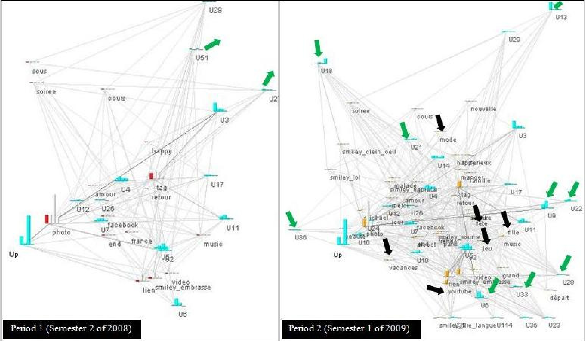
One of the paper's most compelling findings is the visualization of social influence. By comparing two consecutive periods, the researchers could track how the appearance of new friends (nodes U13, U18, etc.) coincided with the emergence of new interests like "Fashion" (mode) or "Festivals." This visual evidence suggests that our interests are often "contagious," spreading through social links.
Critical Analysis & Conclusion
Takeaway
The value of this work lies in its Heuristic Intuition. Instead of looking at a black-box recommendation score, designers can see why a user is suddenly interested in a topic by tracing it back to their social activity and time-of-year.
Limitations & Future Work
The study is currently limited by its reliance on a prototype (Visugraph) and a relatively small initial panel. The authors acknowledge the need to:
- Validate results against established numerical adaptation strategies.
- Enhance sub-graph visualization for deeper "drill-down" analysis.
- Explore how automated information diffusion models can further explain these visual shifts.
This research marks a significant step toward "Transparent AI," where the evolution of our digital selves becomes visible, traceable, and ultimately more human-centric.