
Bridging the Gap: How Visualization Empowers Teachers to Decode Educational Data Mining
Visualizing Learning Analytics and Educational Data Mining Outputs
The paper introduces three custom data visualization (DataViz) tools—Segmented Bar Graphs, Ordered Weights, and Combined Interactions—designed to translate complex Learning Analytics (LA) and Educational Data Mining (EDM) outputs into actionable insights for teachers. Tested with 116 instructors, the study concludes that effective visualization significantly improves teachers' ability to interpret student dropout risks and interaction patterns.
TL;DR
The explosion of online learning has left teachers drowning in data but starving for insights. This paper presents 3 specialized visualization techniques (Viz1, Viz2, Viz3) that transform complex data mining outputs, such as regression weights and association rules, into intuitive "Traffic Light" (RAG) visual reports. The study proves that with the right visual scaffolding, teachers can accurately interpret student performance trends, though professional vocabulary remains a hurdle.
Problem & Motivation: The Digital Disconnect
Despite the rise of Massive Open Online Courses (MOOCs), student retention remains a dismal 15% on average. Teachers are theoretically the "first responders" to this crisis, but there is a massive technical barrier:
- Data Complexity: Outputs from algorithms like SimpleLogistic or JRip (association rules) are readable by data scientists, not educators.
- Lack of Training: Most instructors aren't trained in statistical modeling, making raw Learning Analytics (LA) dashboards more overwhelming than helpful.
- Decision Fatigue: Without clear guidance, teachers cannot bridge the gap between "this student has low activity" and "which specific interaction should I encourage?"
Methodology: Translating Math to Vision
The researchers developed a pipeline to process data from 196 students, focusing on interactions like video watches, gamification badges, and platform access. They utilized the RAG (Red-Amber-Green) convention to categorize students:
- Inadequate (Red): < -1 Std. Dev from mean.
- Insufficient (Amber): Between -1 and +1 Std. Dev.
- Adequate (Green): > +1 Std. Dev.
The Three Visualization Pillars
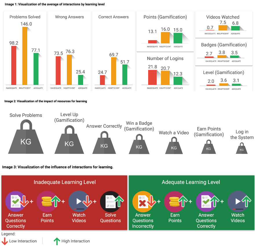
- Viz1 (Segmented Bar Graph): Focuses on individual interaction frequency compared to the average.
- Viz2 (Ordered Weights): Uses SimpleLogistic regression. Instead of showing coefficients, it visualizes which variables "repel" students from failure and "attract" them toward success.
- Viz3 (Combined Interactions): Uses the JRip algorithm to reveal sequences of actions. It calculates an "Importance Score" to highlight which combinations of behaviors (e.g., watching a video + earning a badge) drive performance.
Experiments & Results: What Teachers Think
The researchers conducted an experiment with 116 instructors to test "Understandability" and subjective perceptions (UX).
Key Findings:
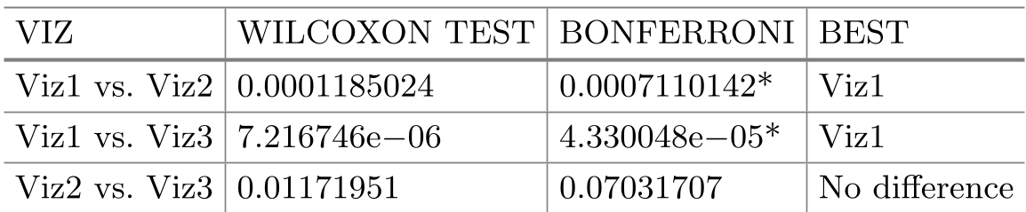
- Familiarity Breeds Clarity: Viz1 was significantly easier to understand than Viz2 and Viz3. This suggests that teachers prefer traditional chart types (like bars) even when the underlying data is derived from complex analytics.
- The "Traffic Light" Success: The RAG color scheme was highly praised for its intuitiveness, allowing teachers to quickly scan for "at-risk" groups.
- The Vocabulary Gap: A critical insight was that the terms used—Inadequate, Insufficient, Adequate—were met with neutral responses. Teachers found the labels somewhat clinical or potentially demoralizing, indicating a need for more "pedagogically sensitive" language.
Critical Analysis & Conclusion
Takeaway
The study demonstrates that high-level EDM algorithms can be "democratized." You don't need a PhD in Statistics to understand a linear regression model if the output is visualized as a directional weight graph.
Limitations
- Static Nature: The visualizations were tested as static images. Real-time, interactive dashboards might yield different "ease of use" results.
- Productivity Uncertainty: Interestingly, while teachers understood the data, they were unsure if it would actually increase their productivity. This suggests that knowing who is failing is only half the battle—the tool must also suggest how to intervene.
Future Outlook
The next frontier in Educational Data Science is not just "Visualizing" but "Actionable Recommendations." Future research should focus on "Pedagogical Explainability"—translating a red bar into a suggested message: "Student A has missed 3 videos; click here to send a personalized reminder."