
WhatsApp Accessibility: Why Design for the "Visual" Leaves Blind Users Behind
17921_WhatsApp accessibility from the perspective of visually impaired people.
This research evaluates the web accessibility of WhatsApp for blind users on mobile devices. Using a case study approach with five participants, the study assesses the application against WCAG 2.0 success criteria across eleven key social networking tasks.
TL;DR
This study investigates the accessibility barriers of WhatsApp from the perspective of five totally blind users. By applying WCAG 2.0 criteria to mobile interactions, the researchers found that while basic messaging is functional, social management tasks (like group administration) are riddled with "silent" errors, unlabeled buttons, and invisible UI changes that fragment the user experience.
Background Positioning
While social networks are celebrated as tools for digital inclusion, they often act as digital "walled gardens" for the visually impaired. This 2016 study was a pioneer in moving the conversation from general web accessibility to the specific, high-stakes domain of mobile-first instant messaging. It serves as a foundational critique of "visual-first" design thinking.
The Problem: The Invisible Interface
The core issue is not that WhatsApp is "unusable," but that it is unpredictable. For a blind user utilizing a screen reader (like TalkBack or VoiceOver), an interface is only as good as its metadata.
The authors identify several "design sins":
- Silent Context Shifting: When the UI changes (e.g., a search suggestion list appears), the screen reader remains silent, leaving the user unaware of new options.
- The "Unlabeled Button" Trap: Hearing "Button 10, unlabeled" provides no semantic meaning, forcing users into a frustrating game of trial and error.
- Feedback Vacuum: Unlike physical buttons, touchscreens offer no tactile confirmation. Without specific audio cues, a user doesn't know if a group was actually created or if a message failed to send.
Methodology: Testing the "Social" in Social Network
The researchers defined 11 tasks specific to the "social" nature of WhatsApp, such as creating groups, designating admins, and sending attachments.
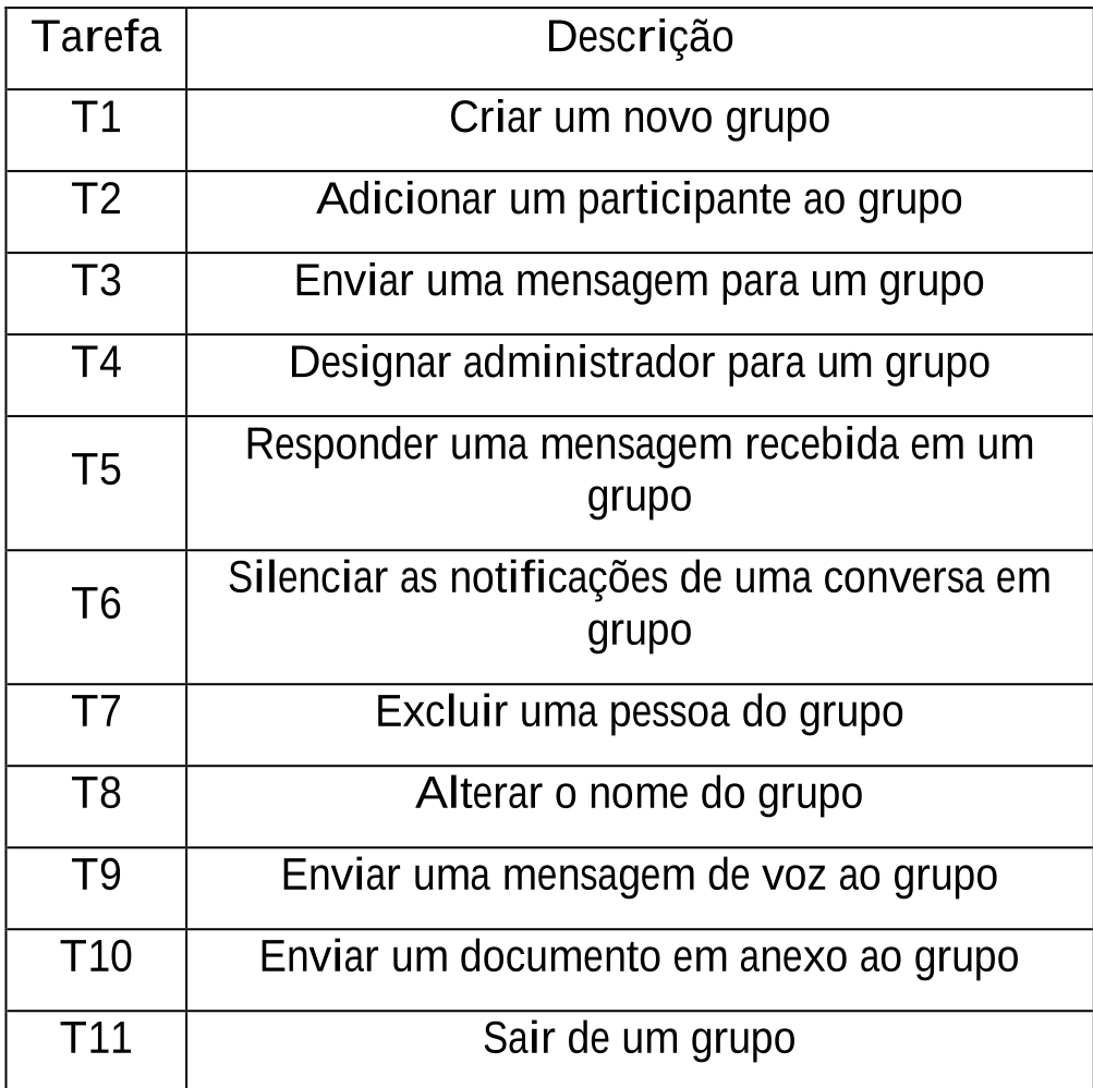 Table 2: Tasks used to evaluate accessibility.
They chose consecutive verbalization, allowing users to complete a task and then explain their logic. This was a crucial methodological choice, as simultaneous talking often distracts from the audio output of the screen reader.
Critical Findings & SOTA Comparison
The evaluation revealed specific failures across three of the four WCAG principles:
1. Perceivable (The "What is this?" Problem)
A major barrier was the Group Data screen. As shown in the researchers' screenshots, the interface displays the "Add Participant" button in two different positions. For a screen reader, this feels like a loop, leading users to believe they are stuck in the same place.
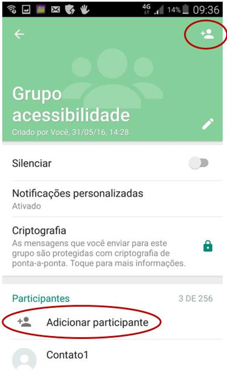 Figure 1: Dual "Add Participant" buttons causing navigation confusion.
2. Operable (The "How do I do this?" Problem)
The Voice Message (T9) task is a prime example of poor mobile operability. The instruction "Press and hold to record" is not read by screen readers. Users often tried to double-tap (the standard selection gesture), which does nothing.
3. Understandable (The "What happened?" Problem)
In group chats, WhatsApp often omits the author's name on consecutive messages to save space visually. However, for a blind user, this makes it difficult to follow the thread of conversation when multiple people are active.
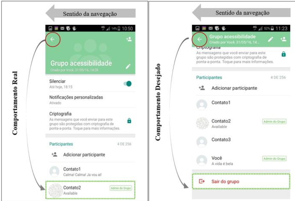 Figure 2: Message sequences often lack readable author labels for every entry.
Deep Insight: Beyond Compliance
The study highlights that Usability ≠ Accessibility. A system can technically pass a checklist but still be a nightmare to use. For instance, while users could eventually figure out how to exclude a person from a group, the "anti-clockwise" navigation logic of the screen reader (Figure 3) didn't match the visual layout, leading to disorientation.
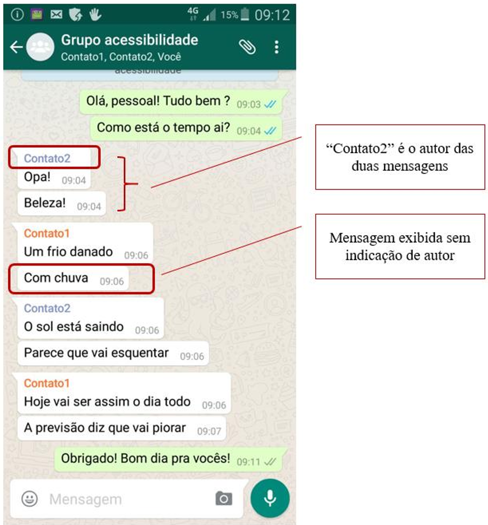 Figure 3: Discrepancy between visual layout and screen reader navigation flow.
Conclusion & Future Outlook
The paper concludes that while WhatsApp provides a vital lifeline for blind users, it places a "cognitive tax" on them.
- Future Work: Modern iterations of this research should look at how AI (like GPT-4o or specialized Vision models) could sit atop the OS to describe these unlabeled interfaces in real-time.
- Industry Impact: This work serves as a reminder to mobile developers that accessibility is not just about "supporting ScreenView"—it’s about designing a logical, feedback-rich secondary interface.
Takeaway: Designers must move away from "visual-first" to "semantics-first" architectures.